Project Background
FlyMate was my senior capstone project at the University of Washington, which culminated two years of coursework in Human Computer Interaction. For Capstone, the guidelines were simple: identify an information problem or need and then create a technical solution to the problem.
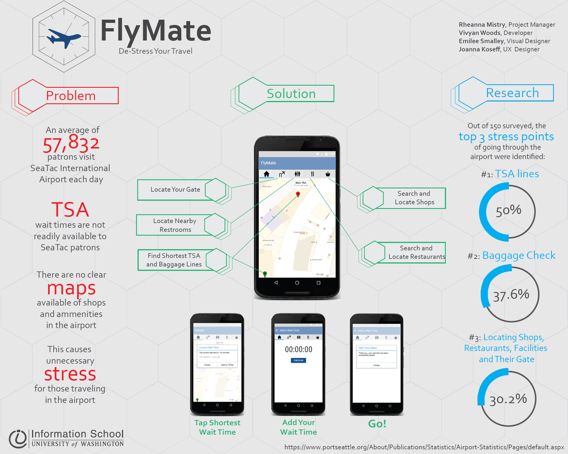
The Problem
It can be difficult for travelers to navigate through an airport with unpredictable baggage and TSA lines. This can cause travelers to waste time and worry about missing their flight.
The Solution
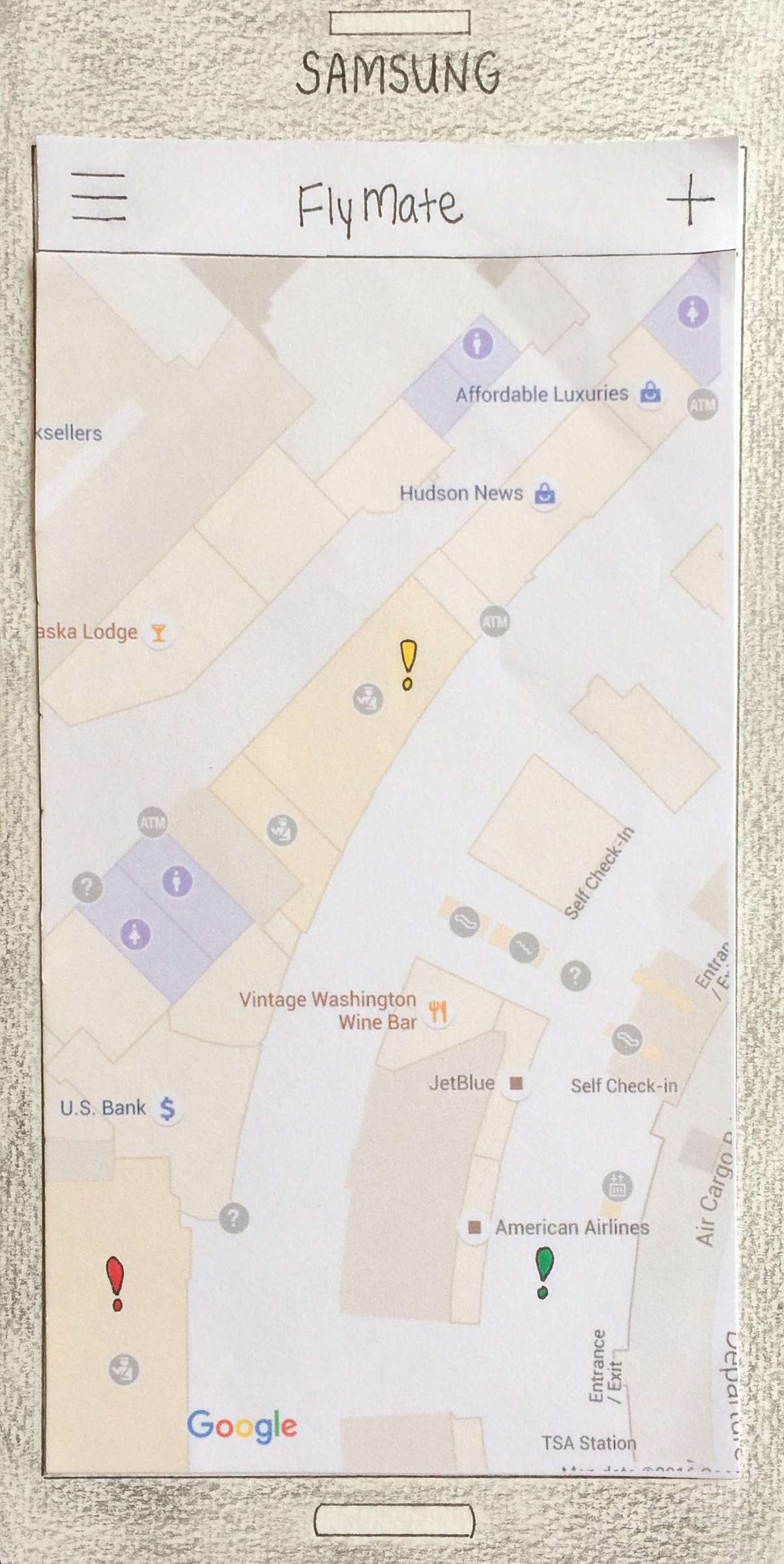
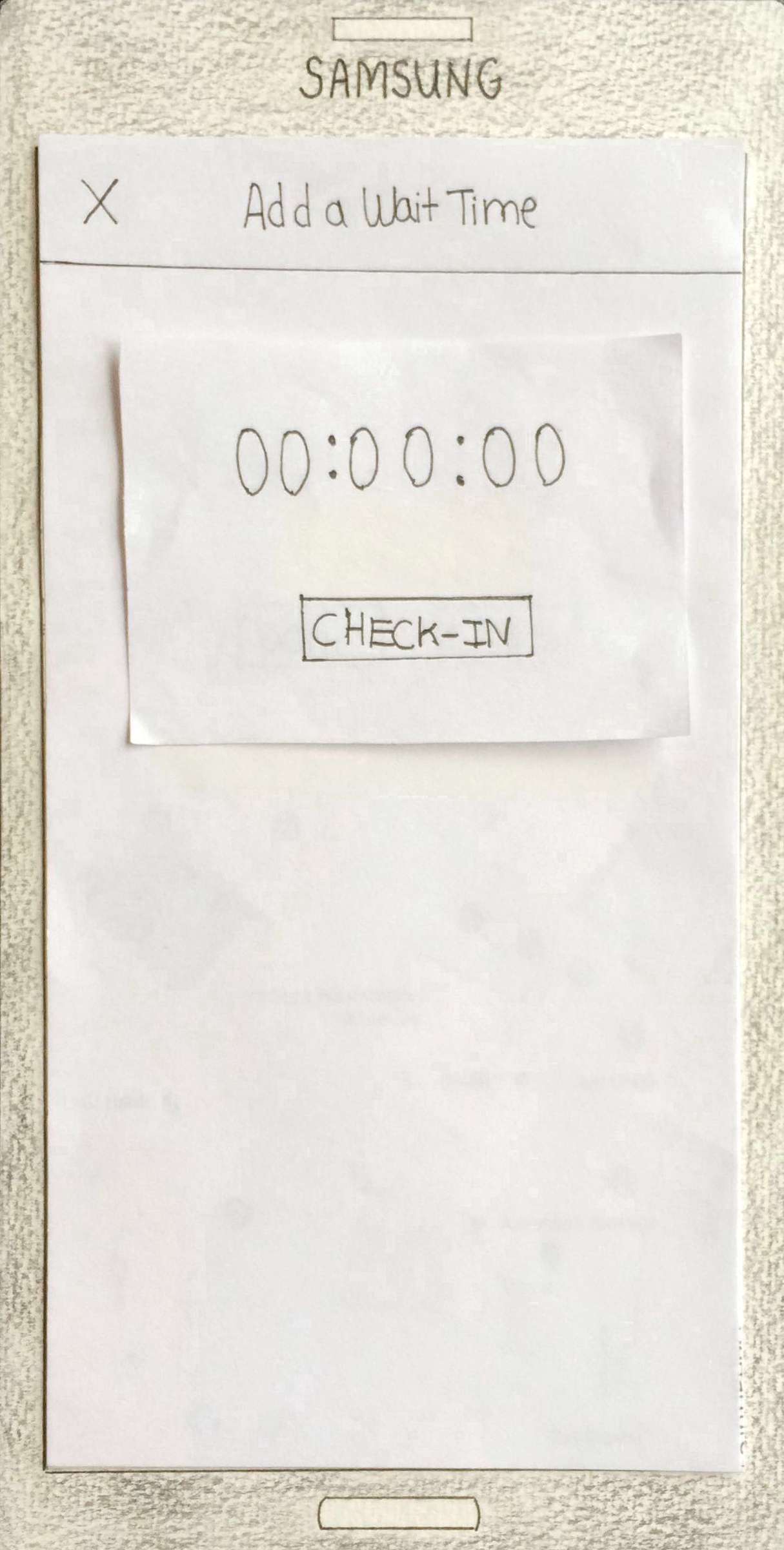
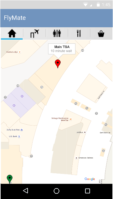
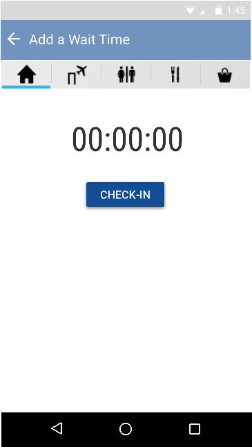
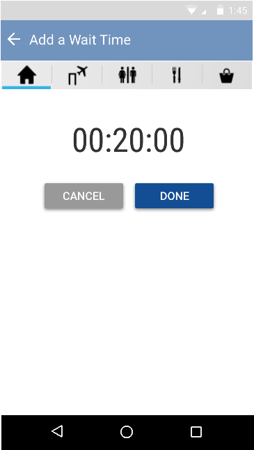
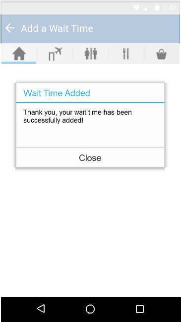
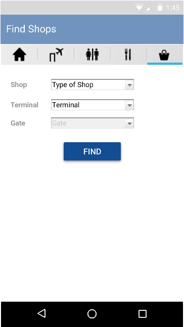
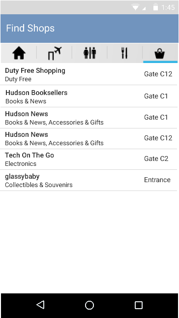
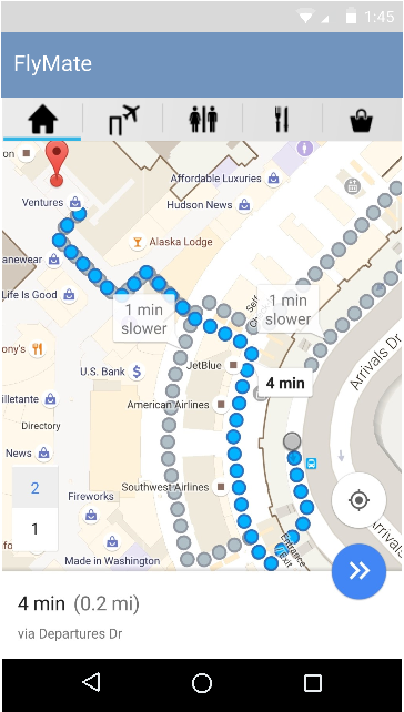
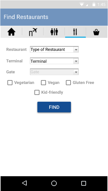
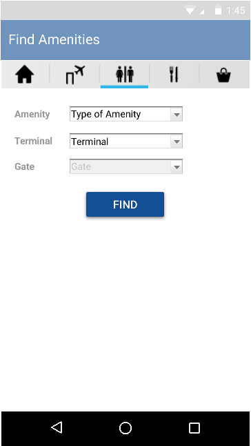
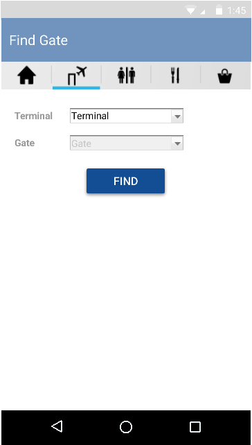
FlyMate is a streamlined, user-friendly Android application which informs users of airport conditions prior to their arrival at the airport. FlyMate provides travelers with information about baggage and TSA line wait times, informs them of nearby shops and restaurants that might meet their needs, and also helps them find the quickest and most efficient route to their gate.
The Process
Online Surveys
To better assess our user’s needs while navigating through an airport, our team created an anonymous online survey consisting of open-ended, multiple choice, and likert-scale questions. We received 149 responses from a wide variety of individuals. The data gathered confirmed a need for an in-airport application.
Notable Findings:
- The majority of respondents said the most frustrating part of flying both domestically and internationally is the TSA lines and not knowing how much time it will take.
- The information that is most important to users when navigating through an airport is TSA and baggage check-in line lengths, followed by the locations of shops and facilities within the airport.
Competitive Analysis
We then examined five related mobile applications and found that while there are a couple apps on the market that display TSA wait times, most of the data is not up-to-date, and none of the apps showed where shops and amenities are located based on your location:
Delta
Features:
- List of amenities within airport.
- General blueprint map of airport.
Pros:
- Narrows in on Delta Terminal.
- Has a few icons on map.
Cons:
- Not detailed.
- Hard to tell your location in airport.
MyTSA
Features:
- Security wait times.
- Thorough TSA information.
Pros:
- People can post wait times.
- Professional and official layout.
Cons:
- Wait times are not very specific.
- Not updated very frequently.

MiFlight
Features:
- Security wait times.
- General blueprint map of airport.
Pros:
- Says when it was last updated.
- Nice graphics; sliding functionality.
Cons:
- Text is hard to read.
- Icons on main screen are unclear.

iFly
Features:
- General information about airport.
- Security wait times.
Pros:
- Progress bar when loading.
- Clear organization of features.
Cons:
- Map doesn’t show amenities.
- Uses blueprint map.

GateGuru
Features:
- A list of amenities with ratings.
- General blueprint map.
Pros:
- Clear icons on main screen.
- Text is still readable.
Cons:
- General blueprint map.
- No wait time.
Personas
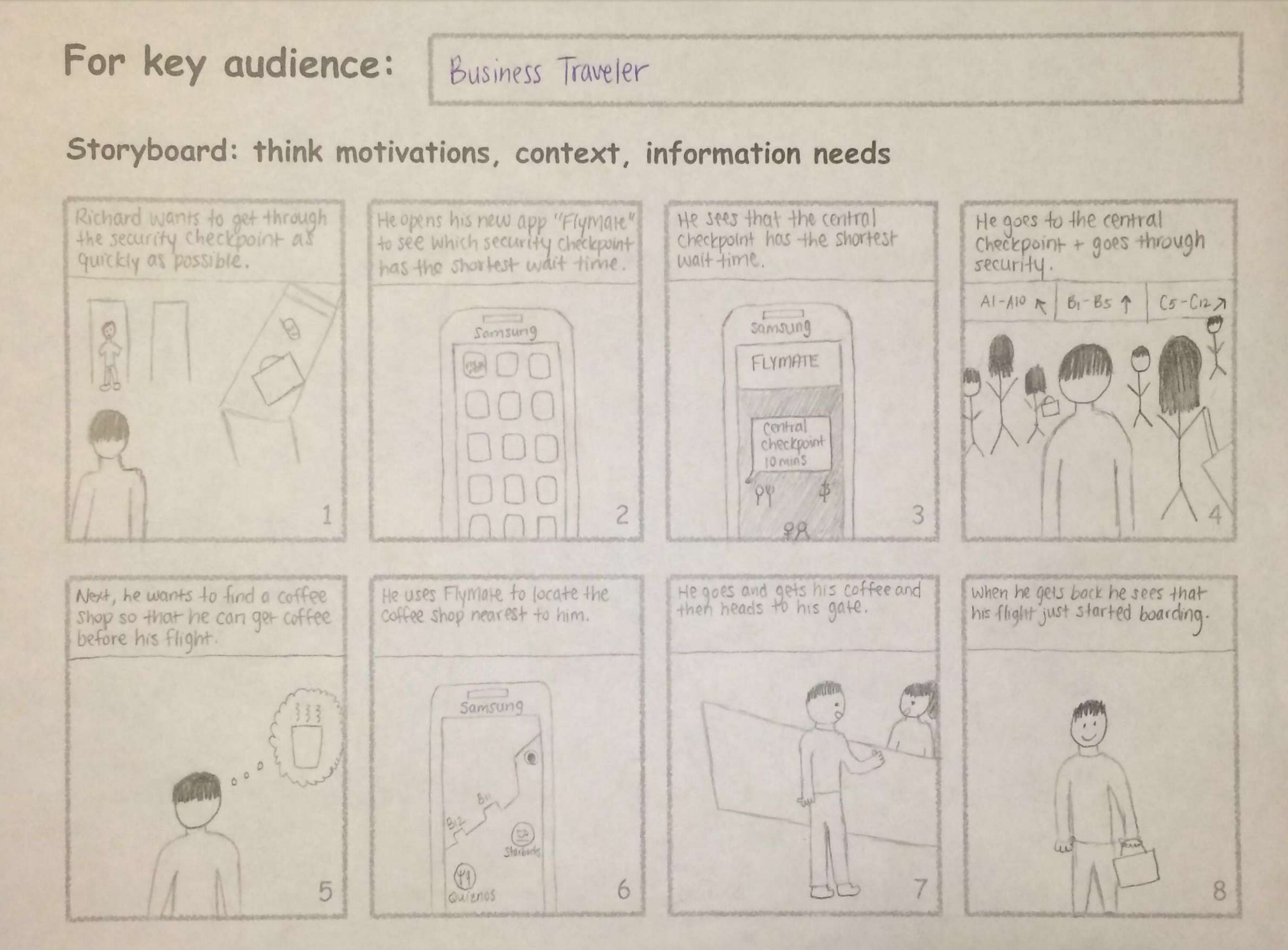
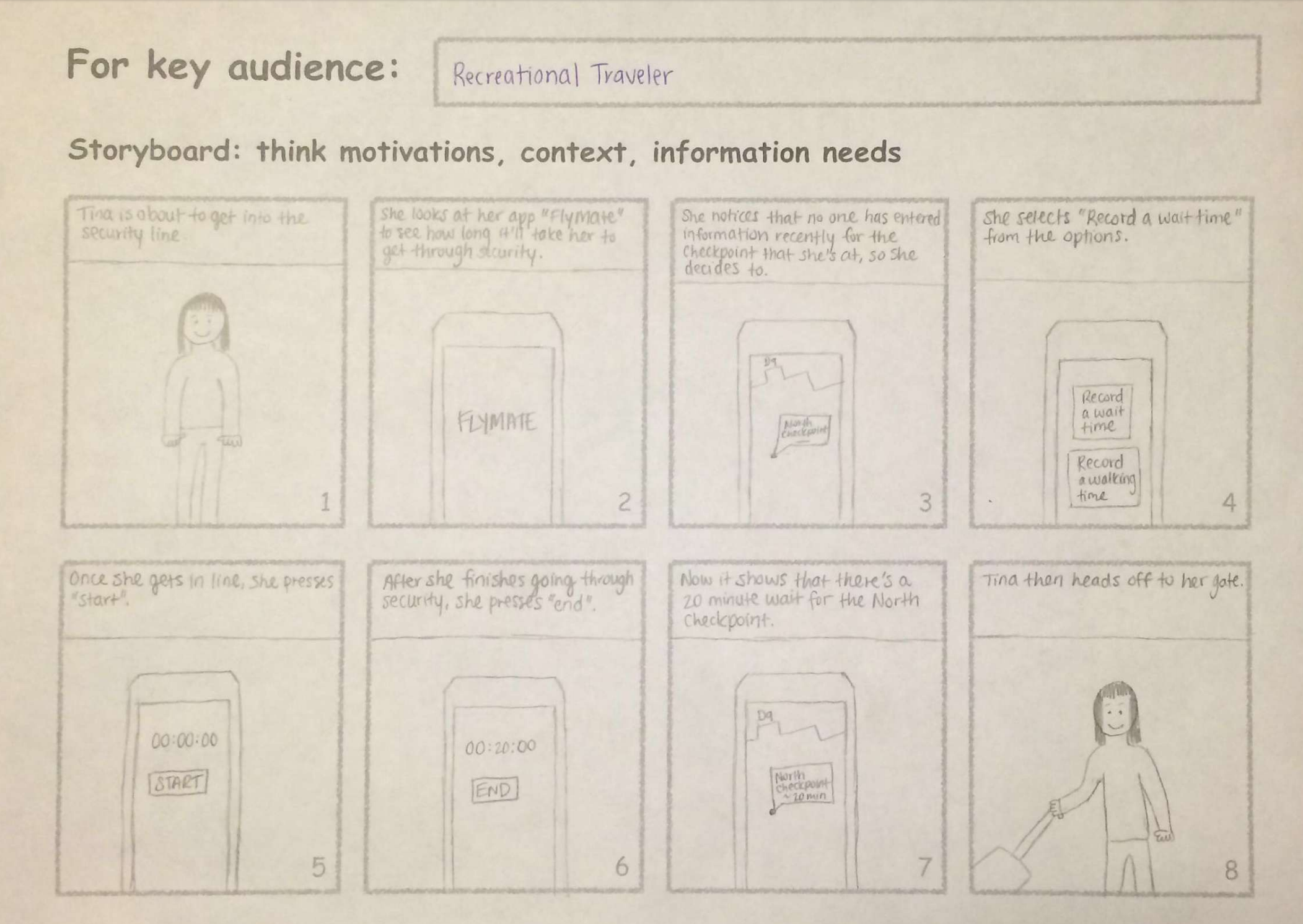
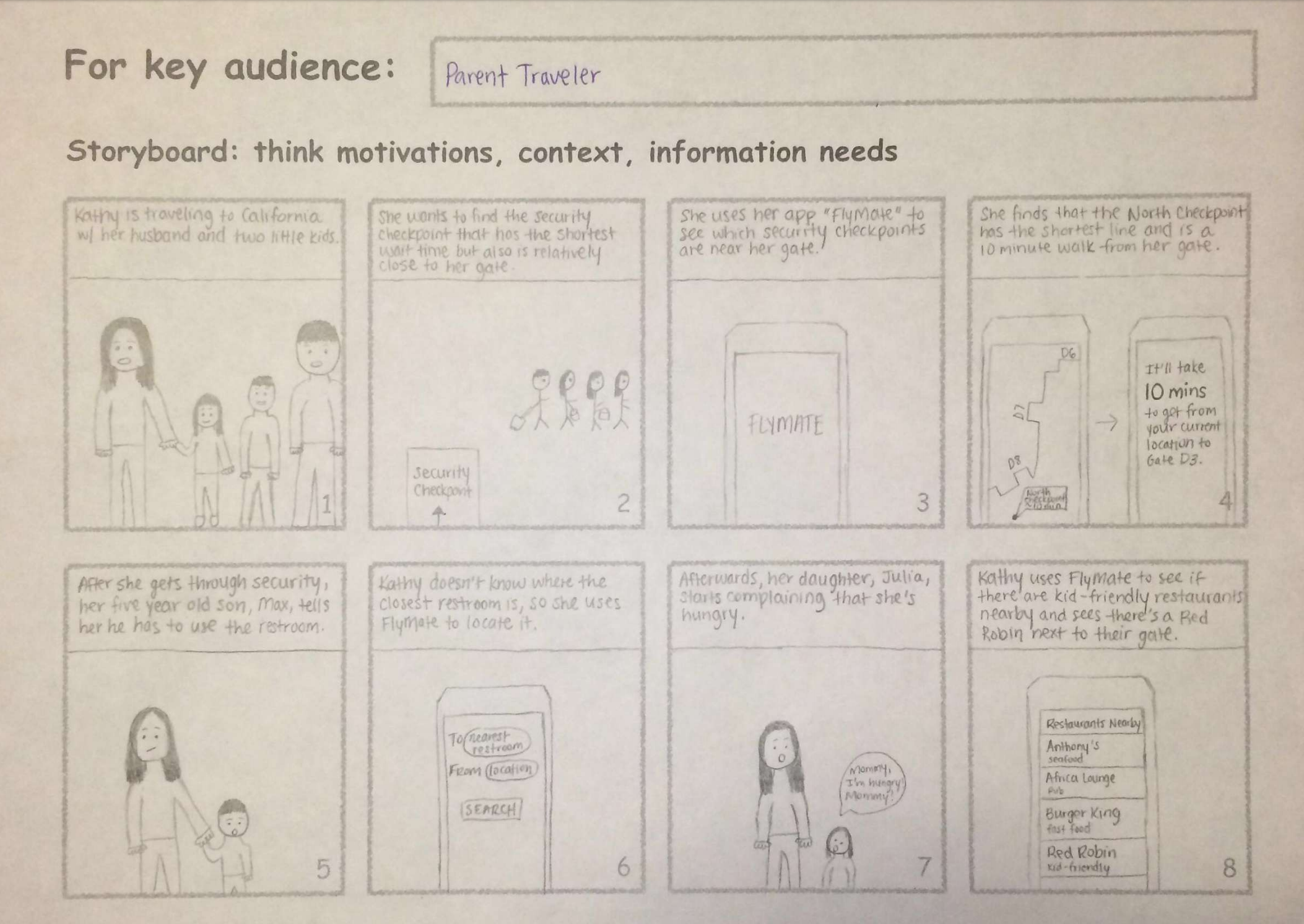
We developed four personas to represent the four types of potential users of the application: Business travelers, recreational travelers, international travelers, and people traveling with kids. We referred back to these persons throughout the design process.
Storyboards
We illustrated possible use cases for each persona using storyboards. These storyboards helped us to understand how our users might interact with the application.

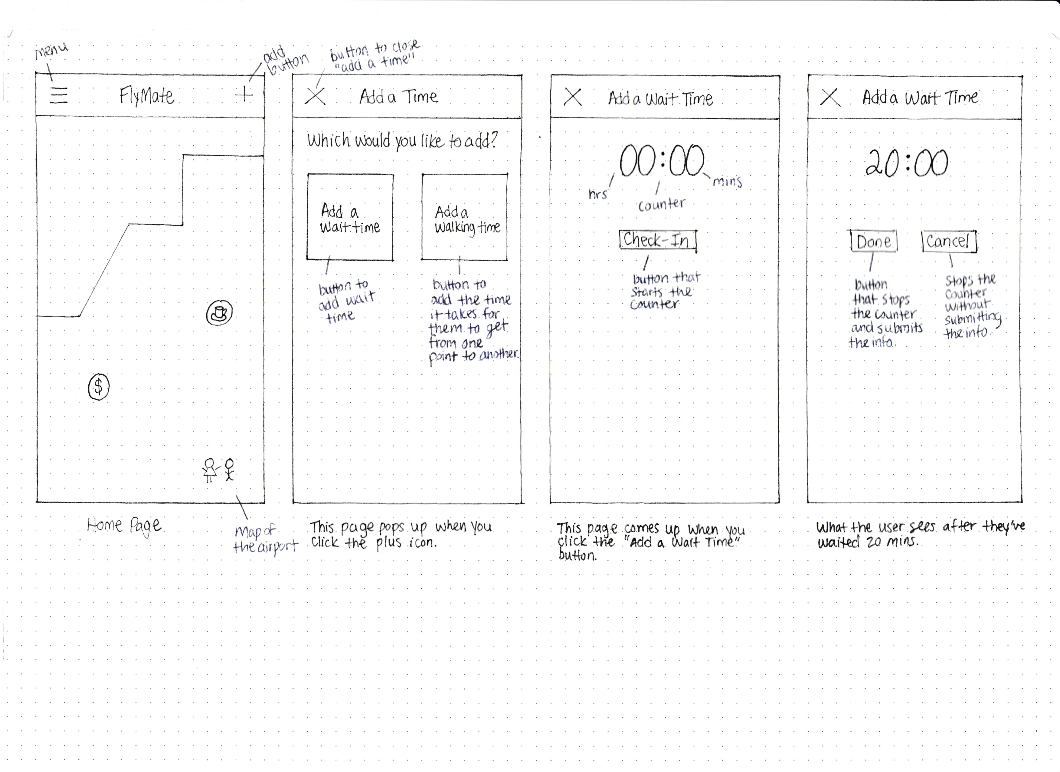
Lo-Fidelity Wireframes
We started out by sketching lo-fidelity wireframes of a potential design of the application.
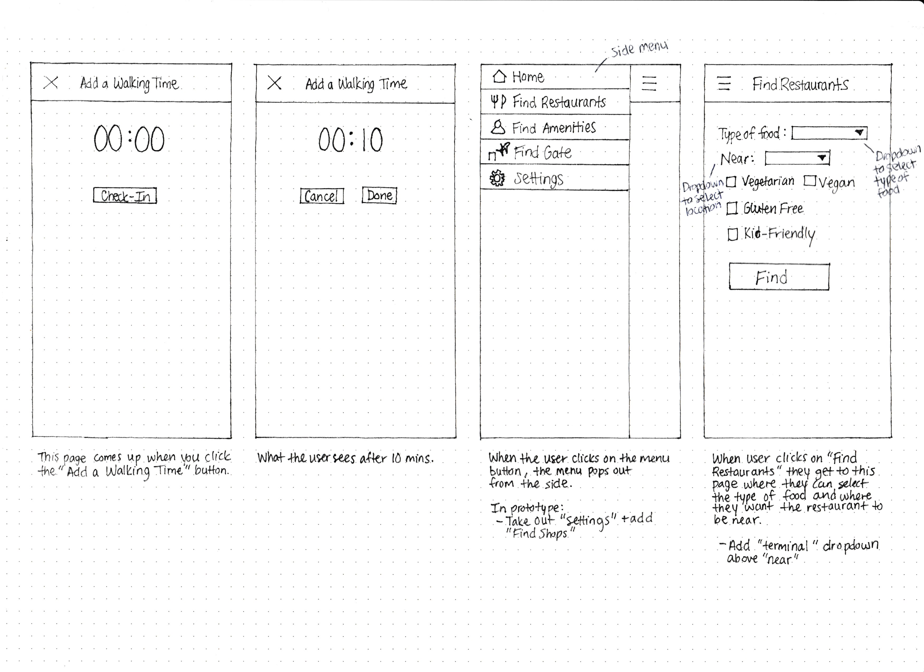
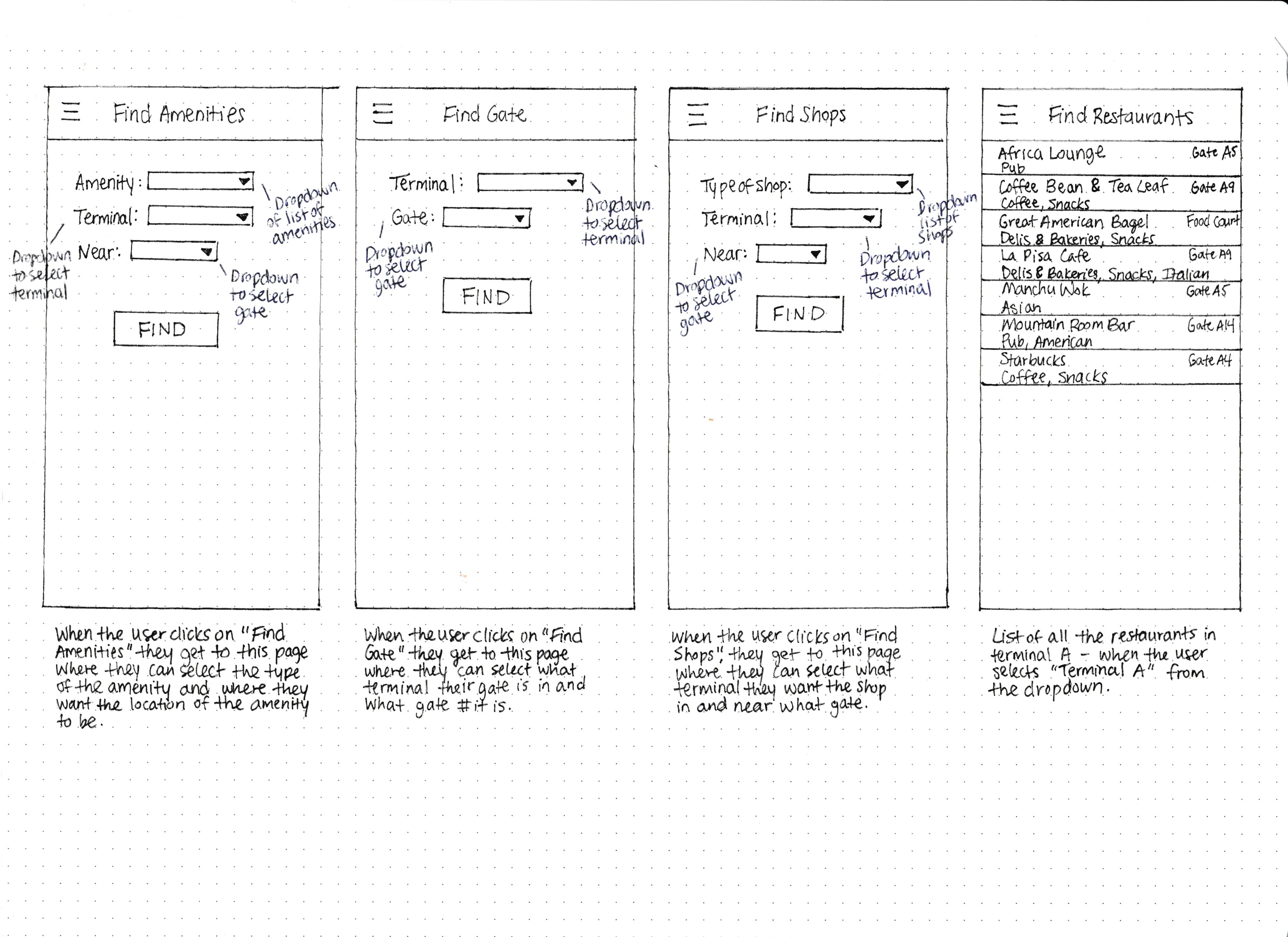
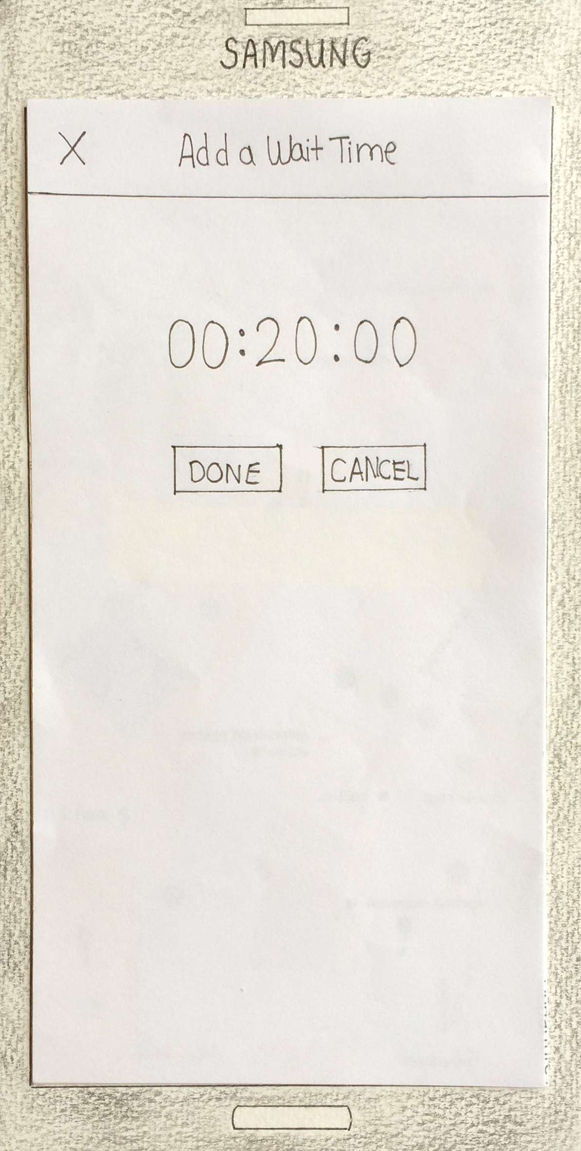
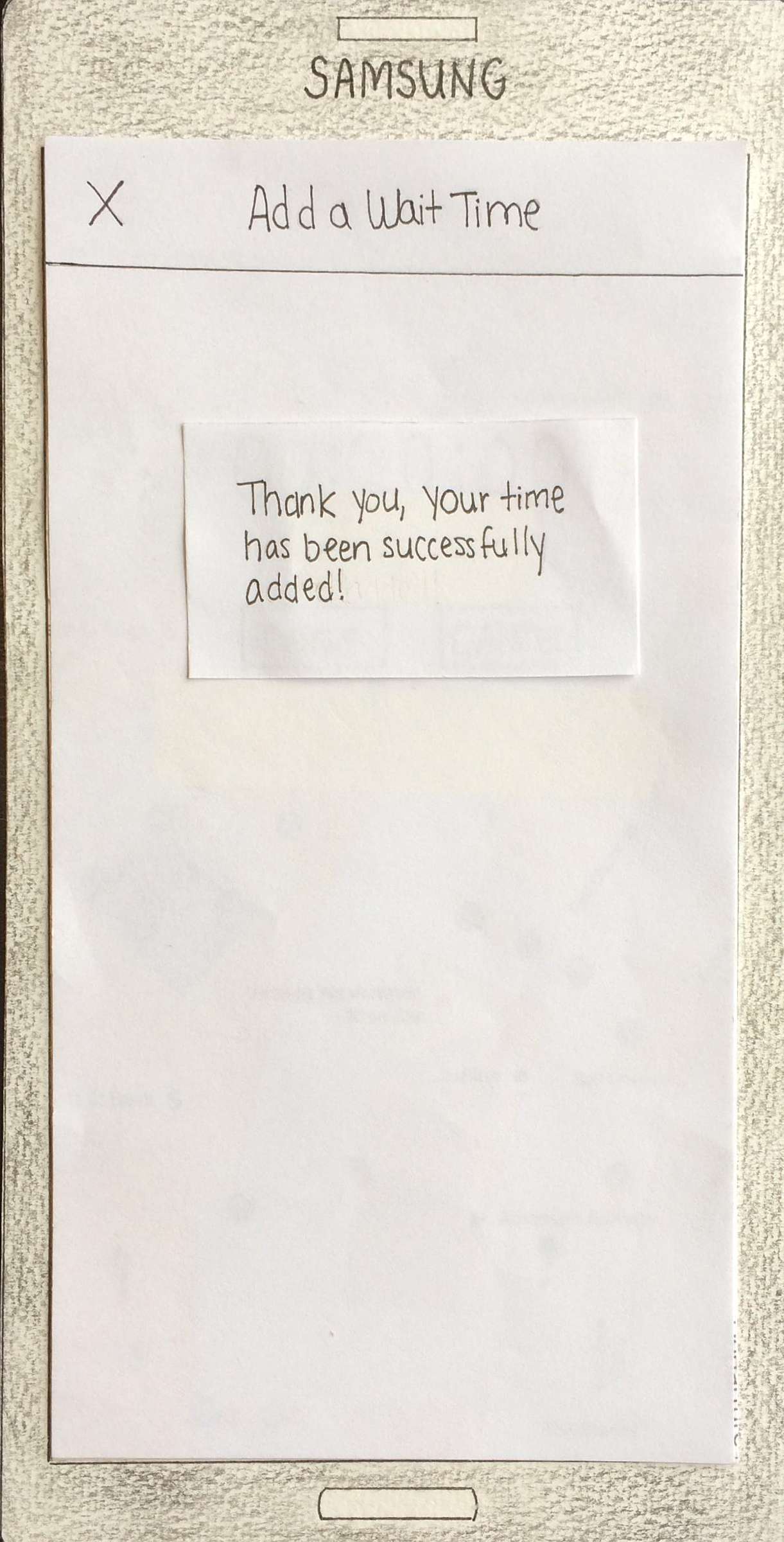
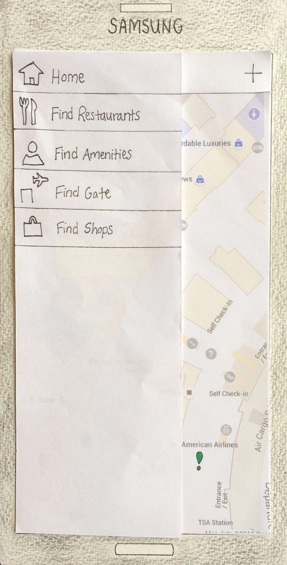
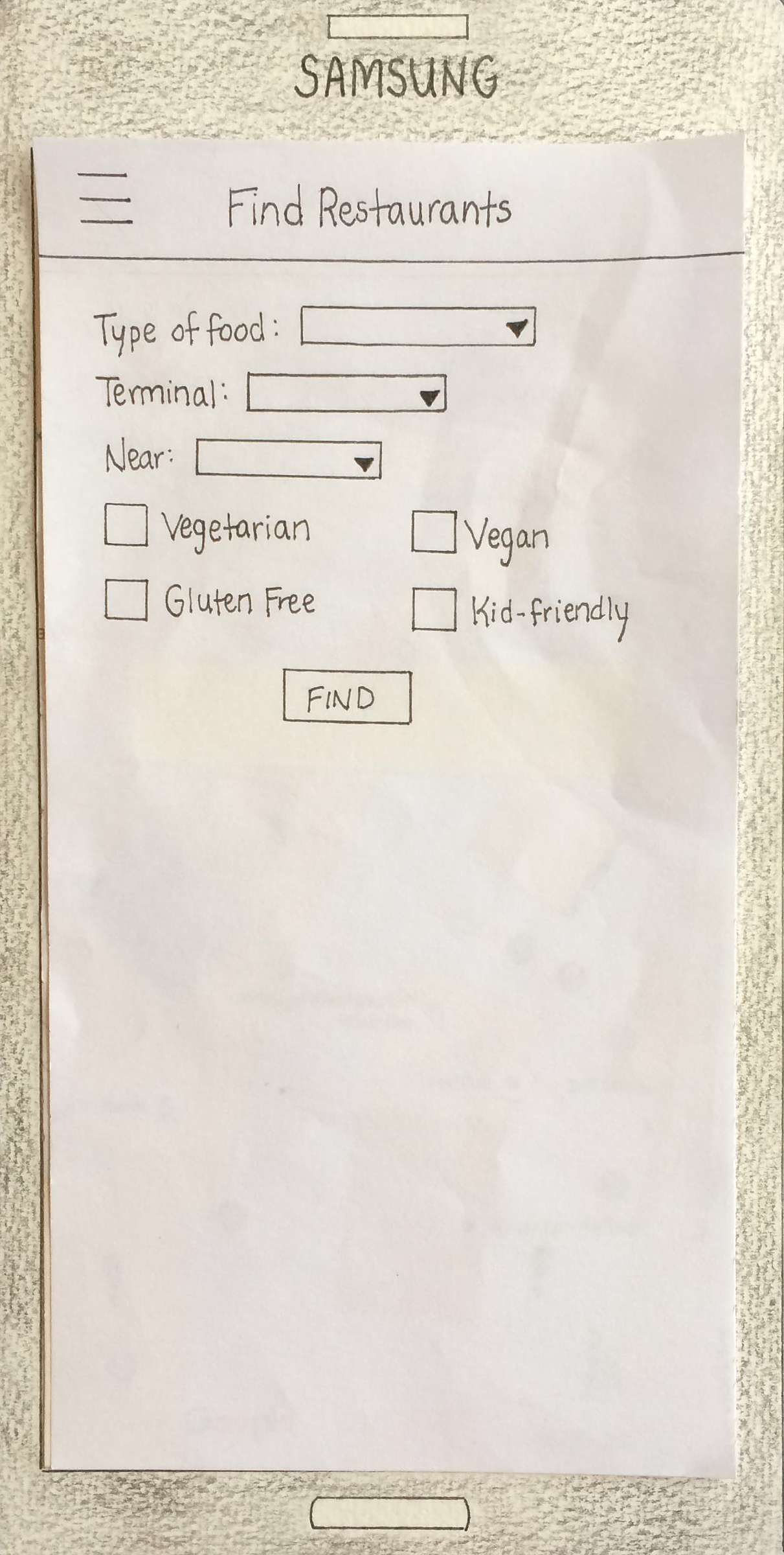
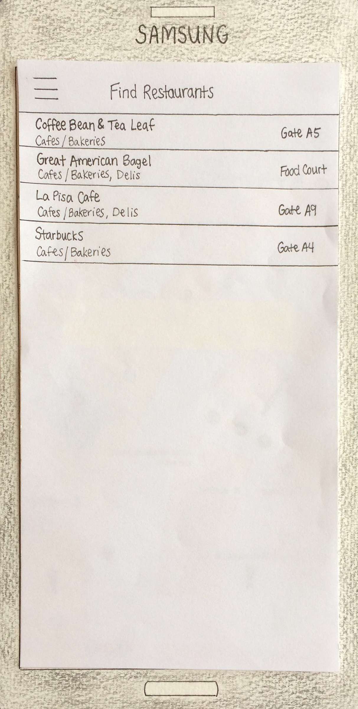
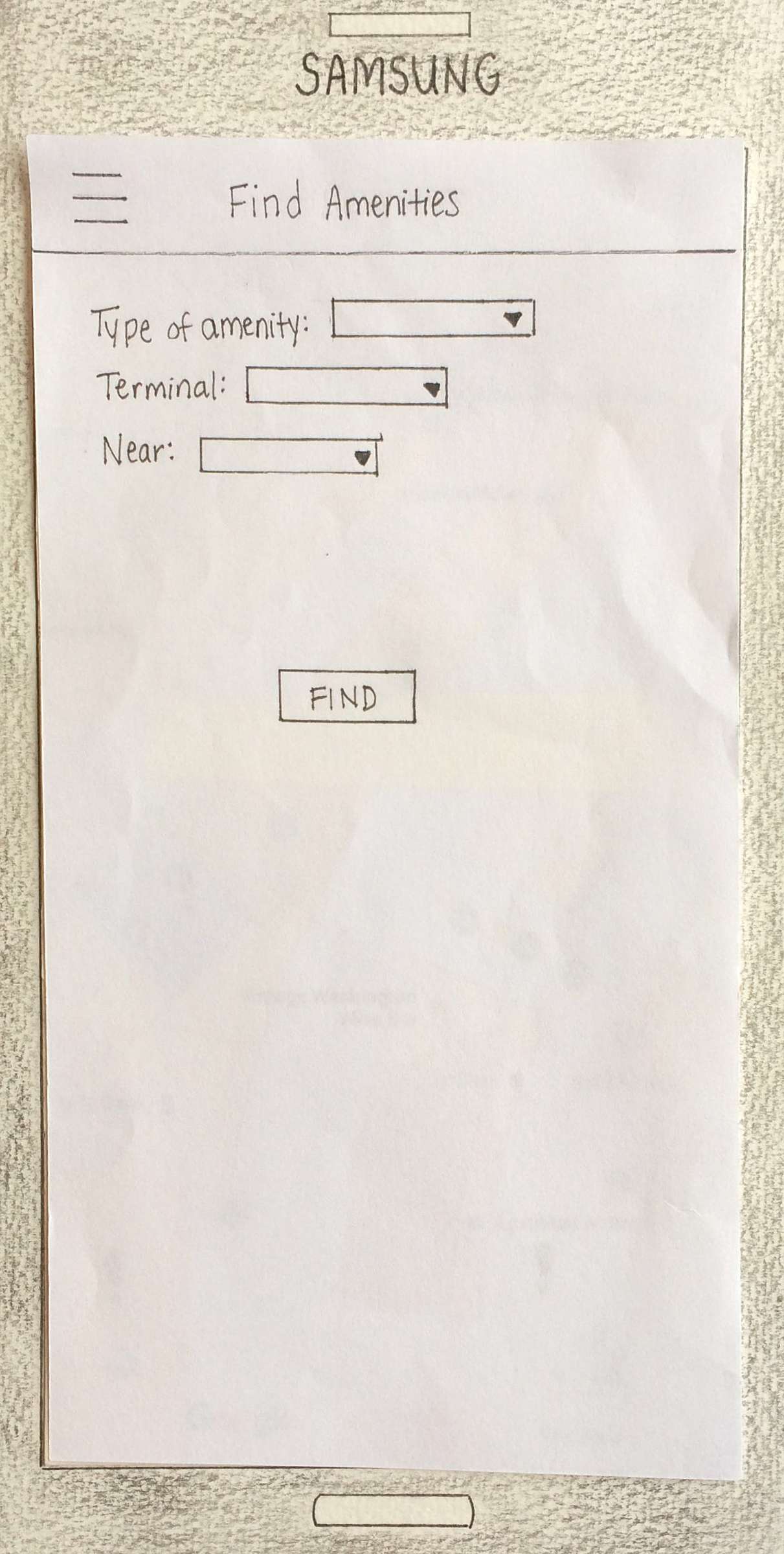
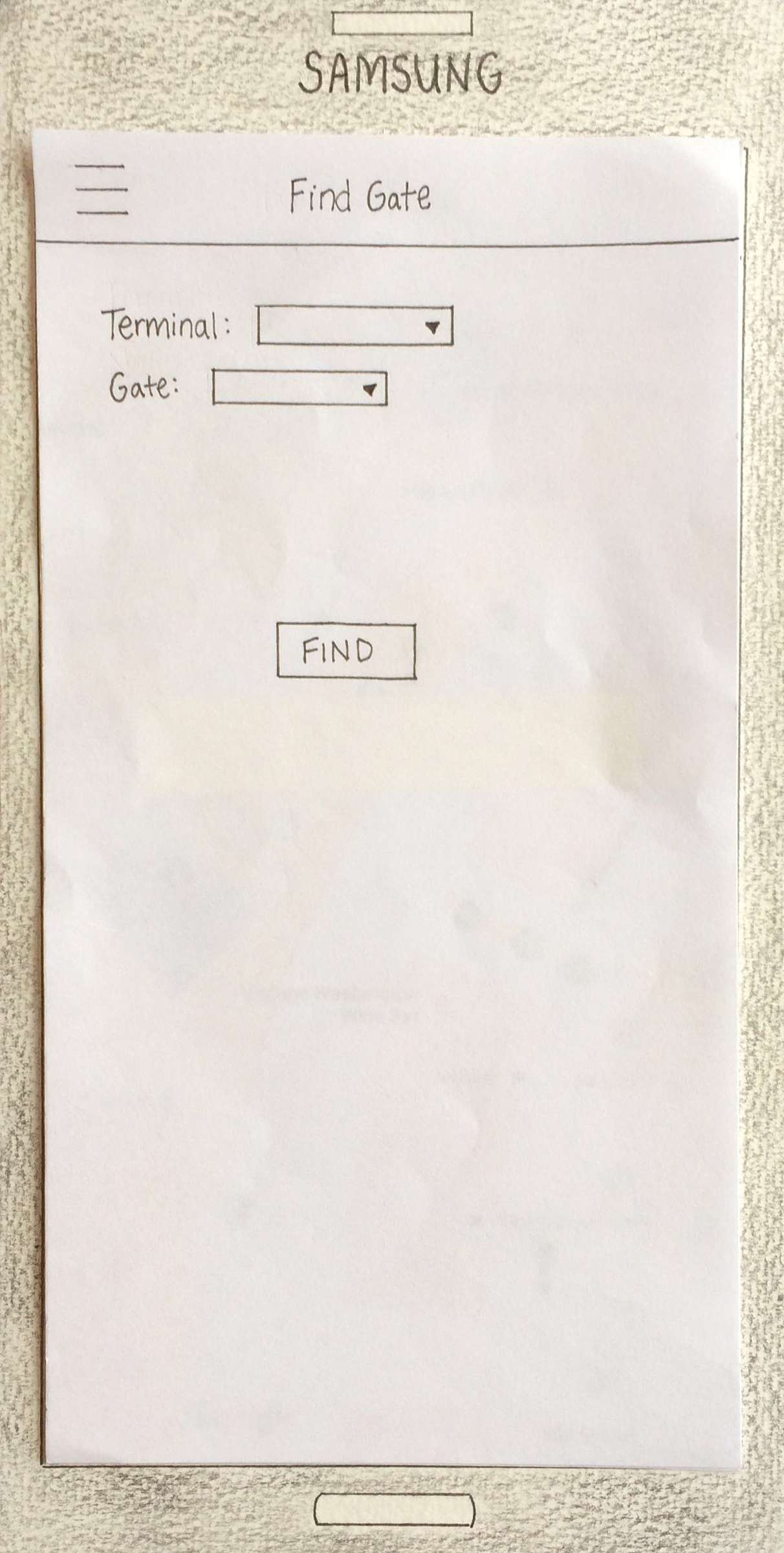
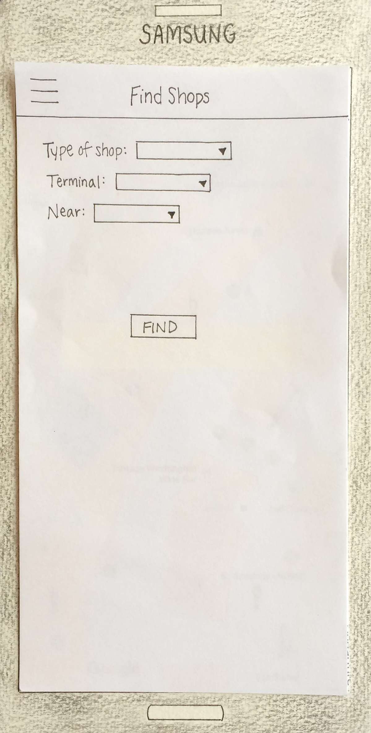
Paper Prototype & Usability Testing
From there, we moved onto creating a paper prototype of our screens. This way we could get users’ feedback on our initial design, without having to commit the time to building out a full prototype.
We conducted usability tests with five participants and asked them to complete a variety of tasks using the prototype. The notable findings from the usability tests include: confusion about what the TSA alert icons stood for and what the plus icon meant.
Other than those two things, the users found the app pretty easy to navigate around.
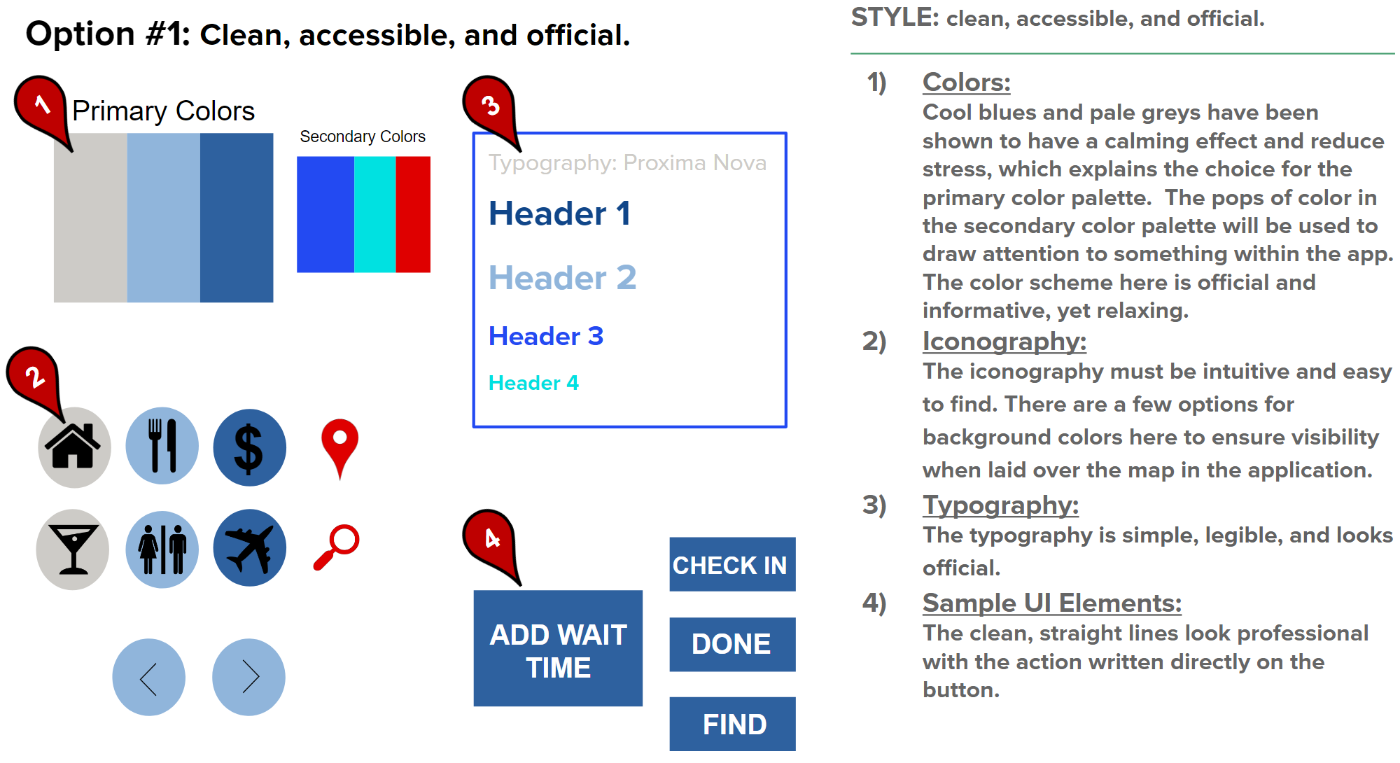
Moodboards & Styleguide
For our color palette, we decided to use cool blues and pale grays because they tend to have a calming effect and reduce stress, while also utilizing red to draw the user’s attention to key areas. Icons were used frequently throughout the application to cut down on the amount of text displayed on the screen.
Hi-Fidelity Prototype
This hi-fidelity prototype was created using Axure and utilized our style guide. Afterwards, we did one final round of usability testing and then passed the designs off to the developer.
Finished Product
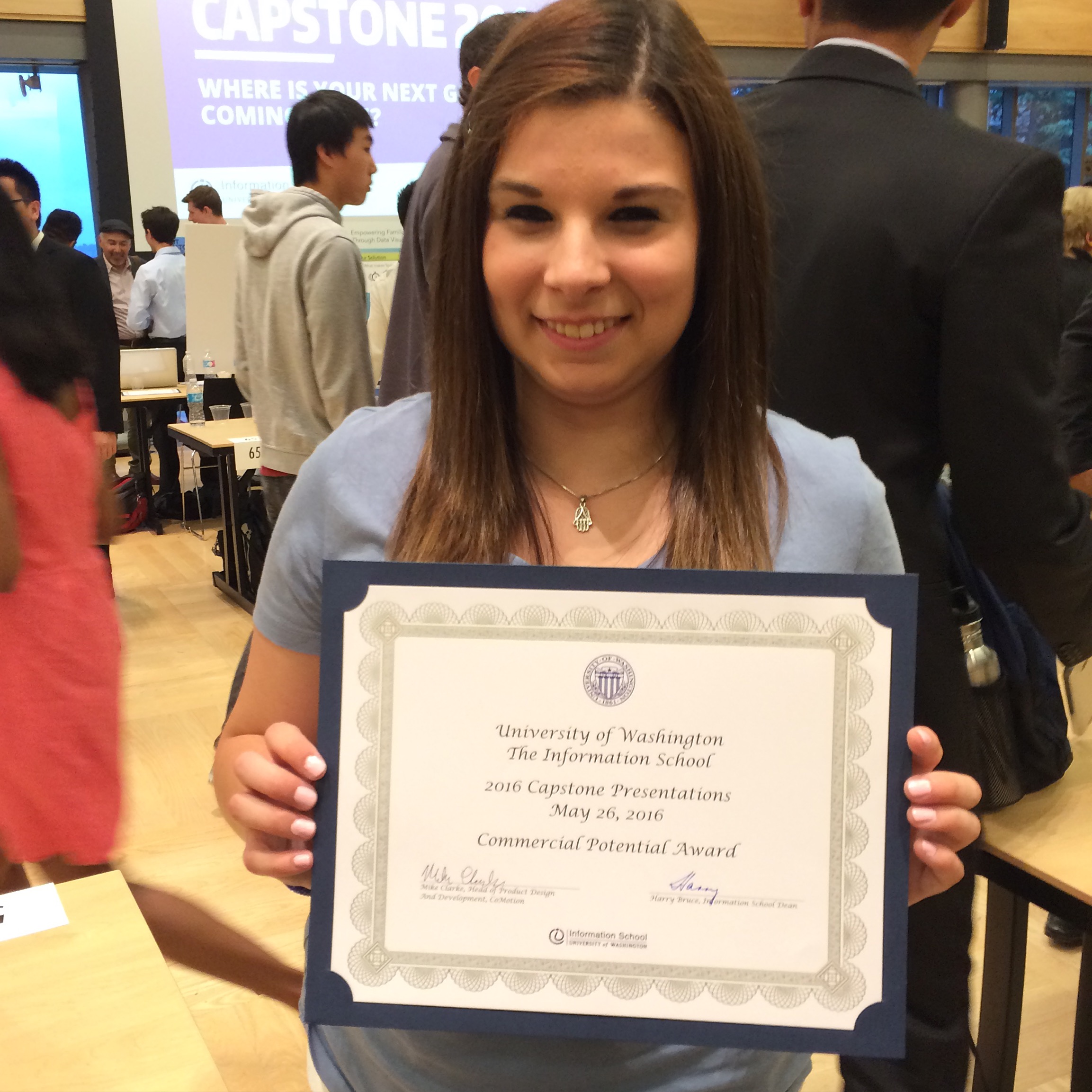
We presented our finished product to panel members at the 2016 Informatics Capstone Event, and out of roughly 125 teams, our team won one of the seven awards handed out that night.