Introduction
Sweet Inspirations is a business that sells handmade chocolates and candies. They were unsatisfied with their current website, so as a school assignment I decided to create a version of their website (from scratch) that I thought would better suit their business and be more user friendly.
Brainstorming
Current website:
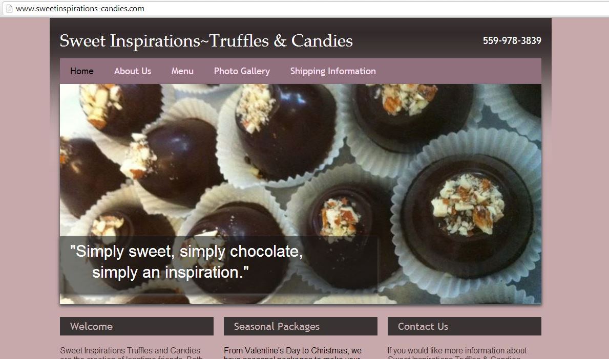

Color: On their current site, they used a shade of purple as the background. I thought that the purple they chose made the pictures of the truffles blend in with the background, and one should make the pictures of the products they’re selling stand out. However, I liked the concept of using purple as the background. Purple is a color that represents luxury, richness, and delicacy. Therefore, I thought that it’s appropriate to use this for the background, since those qualities represent the truffles.
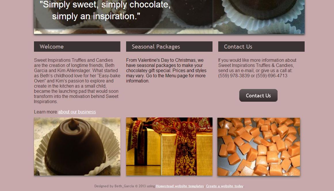
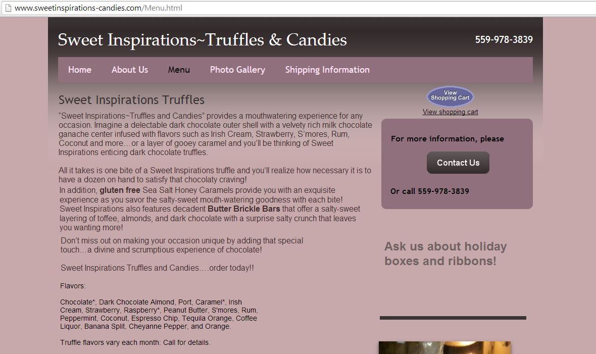
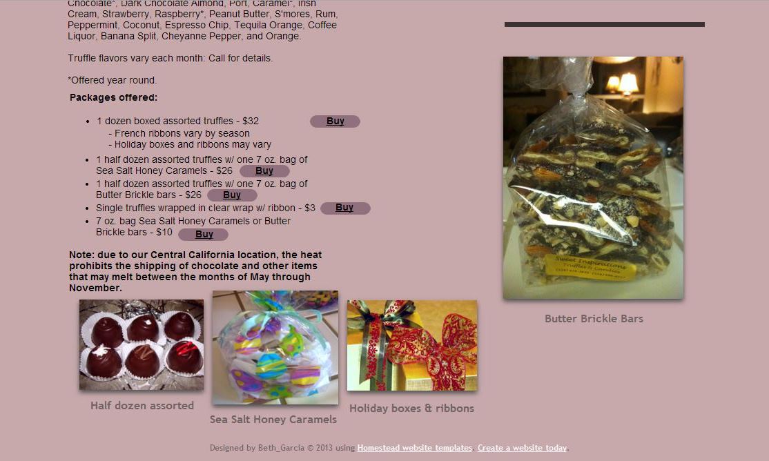
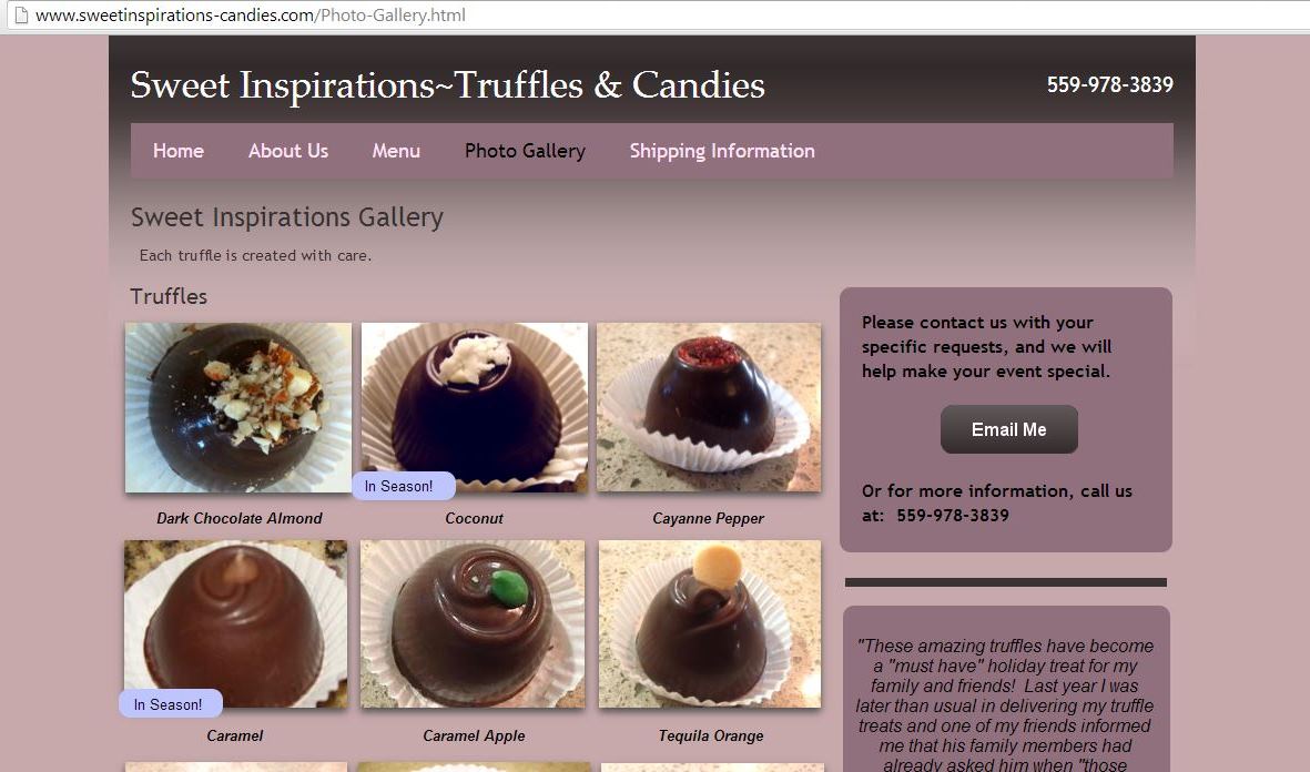
Layout: There were a few aspects that I liked about the layout. However, overall I thought that the layout was very poor. For starters, the Menu page was all over the place. All of the pictures of the truffles and candies were small and at the bottom of the page. Secondly, there was too much text at the top of the page; the user is probably not going to read all the text, they’re just going to scroll down to where the packages offered are listed. Thirdly, the list of flavors text was smaller than other text on the page, and it was all squished together, which therefore made it harder to distinguish the different flavors. Lastly, the text of the different packages offered was smaller than other text as well, and in my opinion, that should be the largest text on the page so that it easily stands out, since that’s the main thing that people are going to be looking at on the page. The layout of the other pages on the site weren’t as bad as the Menu page, but they still looked very messy and disorganized.
Home Page Image: I liked the fact that they had a main image on the Home page. However, I thought that an image slider on the Home page would make the website more attractive. Also, the text on the image was too big, in my opinion.
Mobile Compatibility: The current site didn’t have a mobile layout, and I think it’s essential that a site have a good mobile layout, especially since now in days a majority of people access websites on their smart phones.
Ideation
I started with a style tile:
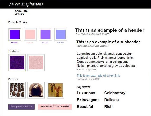
Since I liked the fact that it represents luxury and richness, I decided to use purple as the background on my website. However, I picked a brighter purple to use, that way the pictures of the truffles stand out more. For the main navigation bar, I decided to use a light pink color. I chose this color because pink is a color that often goes well with purple. However, I made this pink light enough so that it wouldn’t overwhelm the purple, but instead compliment it.
For the body text I decided to just go with an easy to read font and font size. For the main title on the website I wanted to do a cursive-like font, but cursive fonts are sometimes hard to read. Therefore, I decided to go with Monotype Corsiva. Monotype Corsiva has a cursive-like style to it, but it’s also easy to read.
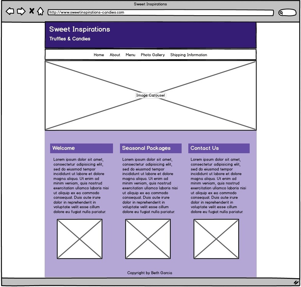
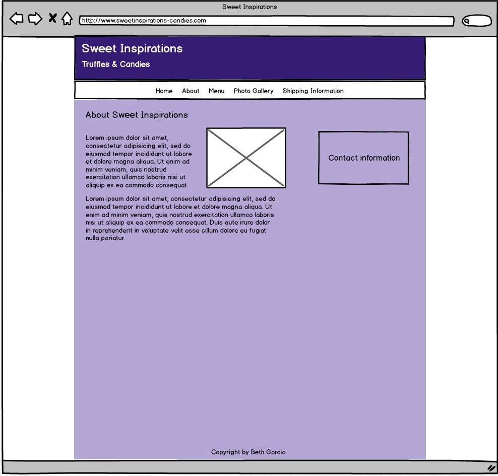
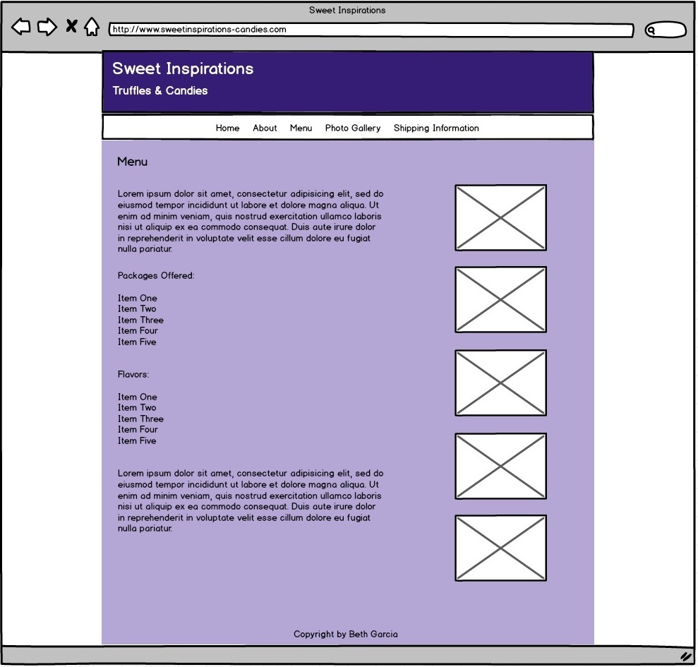
After figuring out what aspects of the website I wanted to change, I came up with the following wireframes of what I thought the website should look like:
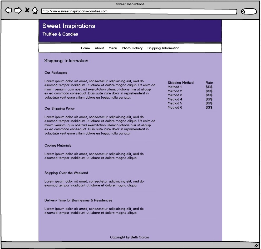
Desktop wireframes:

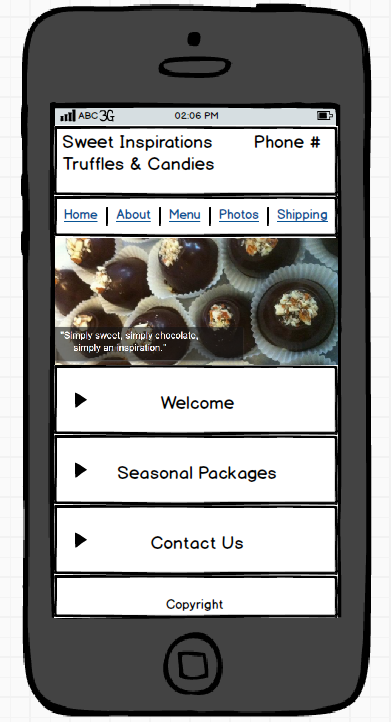
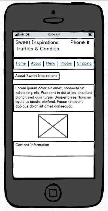
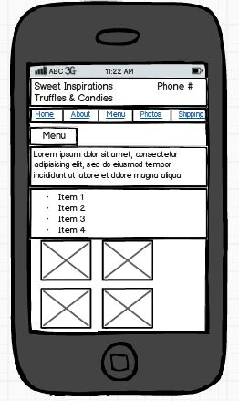
Mobile wireframes:
Tablet wireframes:
Final Product
URL:
http://students.washington.edu/jkoseff/info343/sweet-inspirations/index.html
As you can see, there are quite a few aspects that I changed about the website:
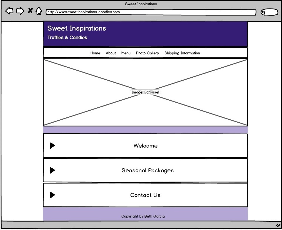
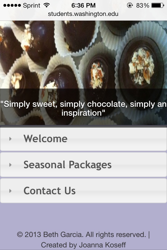
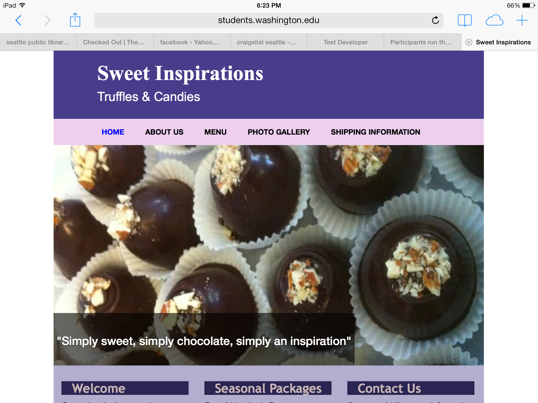
Image Slider: Instead of a single Home page image, there is now an image slider on the Home page with four different images of the truffles and quotes from customers.
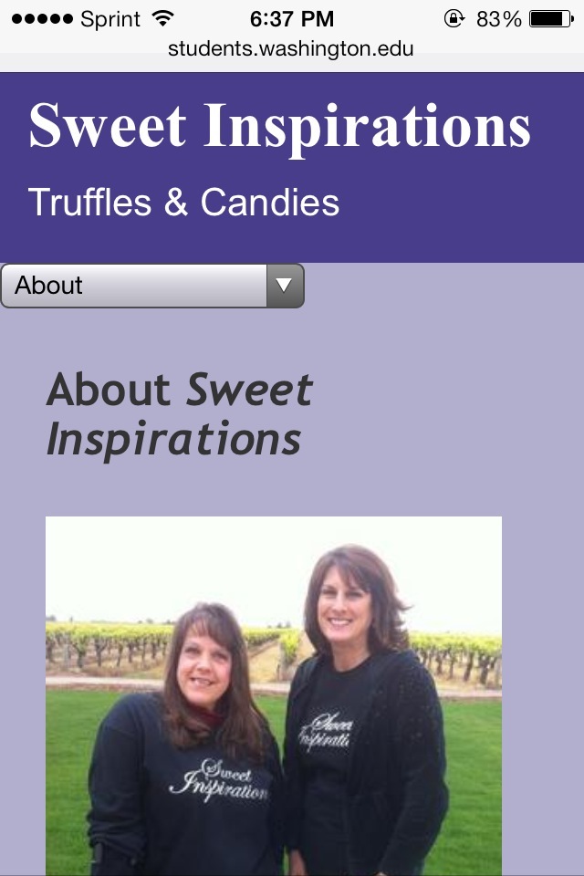
Color: As I mentioned above, I used a brighter purple for the background color of the website, in order to give it a more exuberant feel and in order to make the truffles stand out more. I also made the header color a dark blue/purple to compliment the purple background. Lastly, I made the main navigation bar a light pink color, in order to compliment the purple.
Header: Not only did I change the color of the header, but I also changed the font and layout. Before, the title and tagline were on the same line. However, the business is called Sweet Inspirations, not “Sweet Inspirations – Truffles & Candies”. Therefore, I put the tagline below the title, and in smaller font. Thirdly, I made the text color white, in order for it to be visible on the dark background, and I changed the title font to Monotype Corsiva in order to make it look elegant.
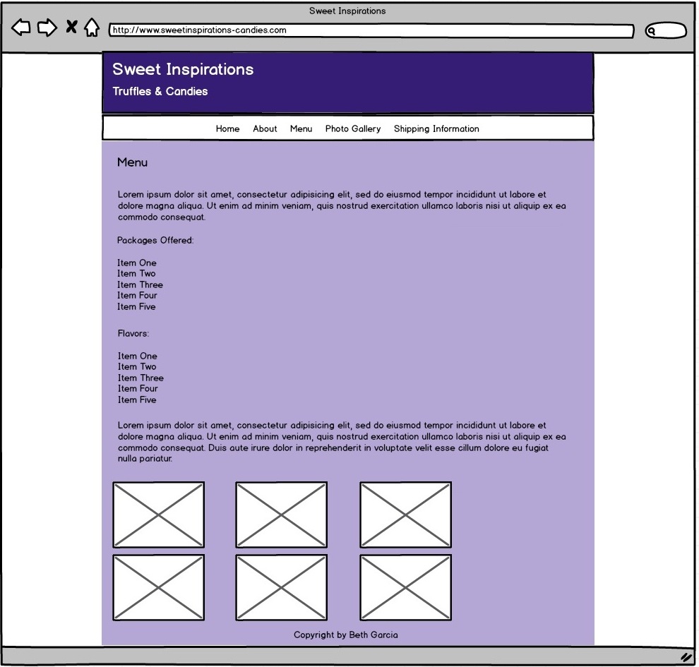
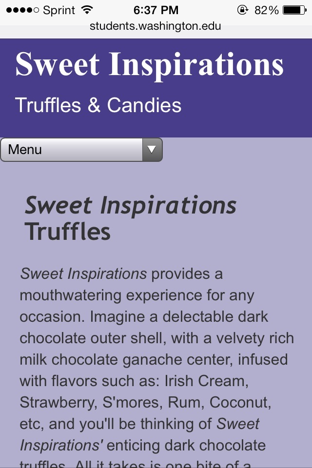
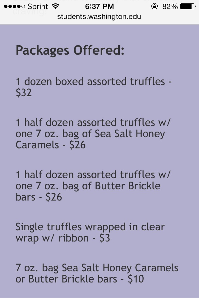
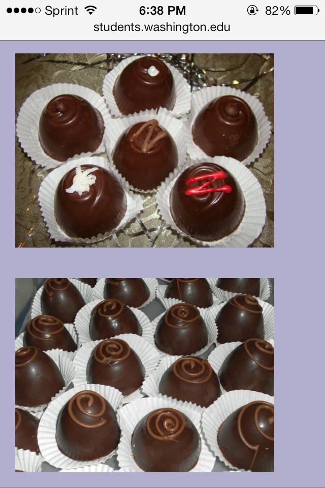
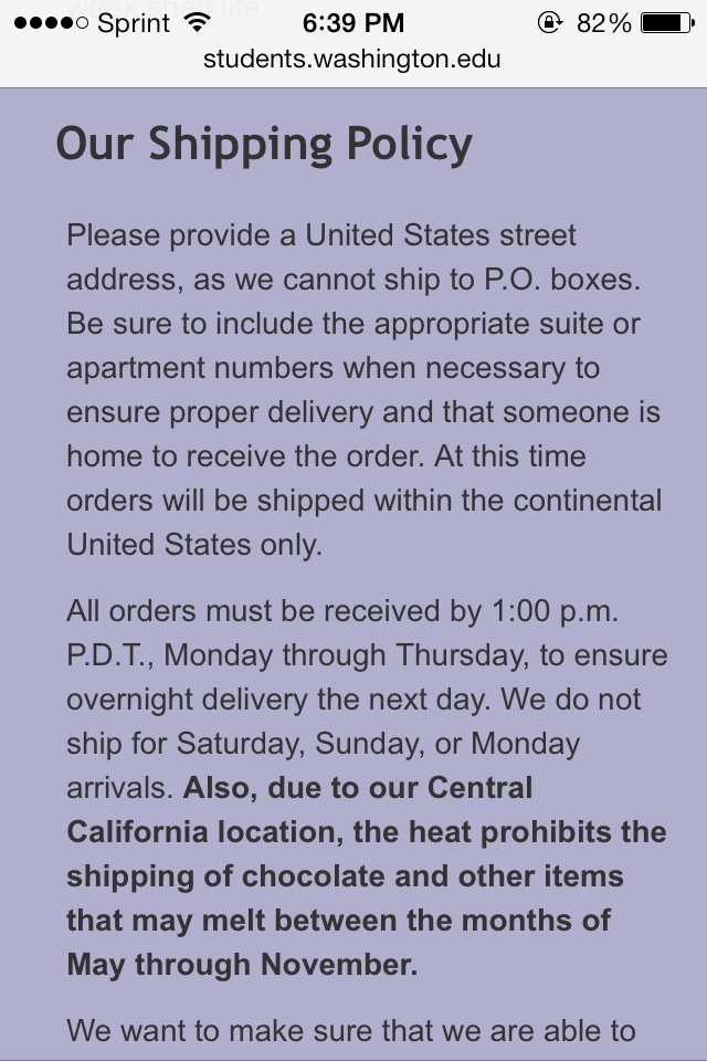
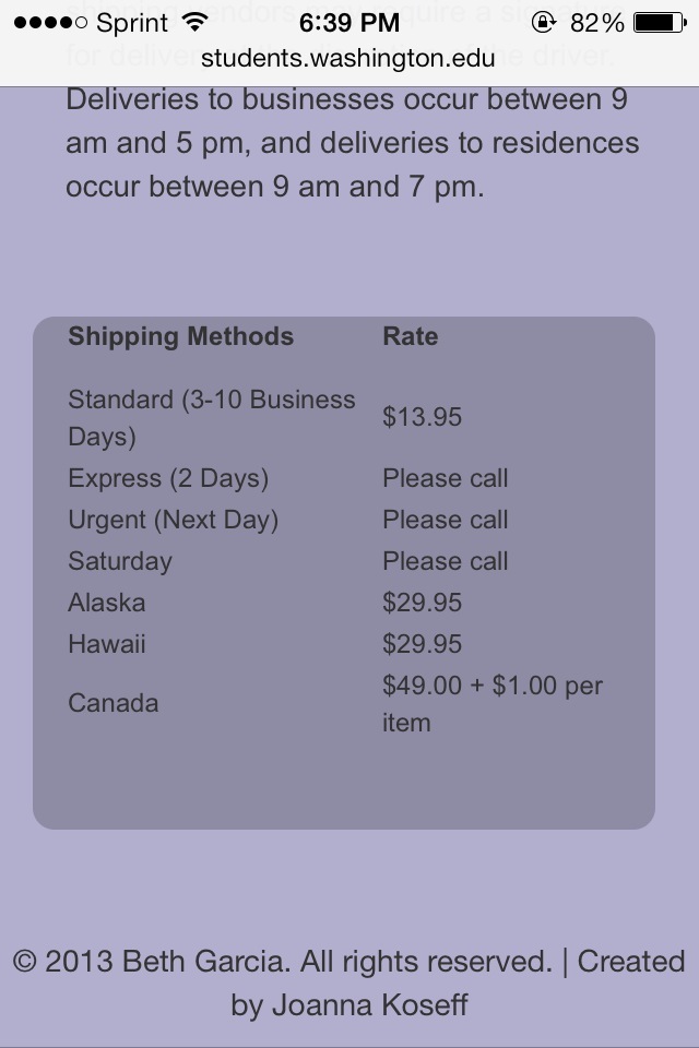
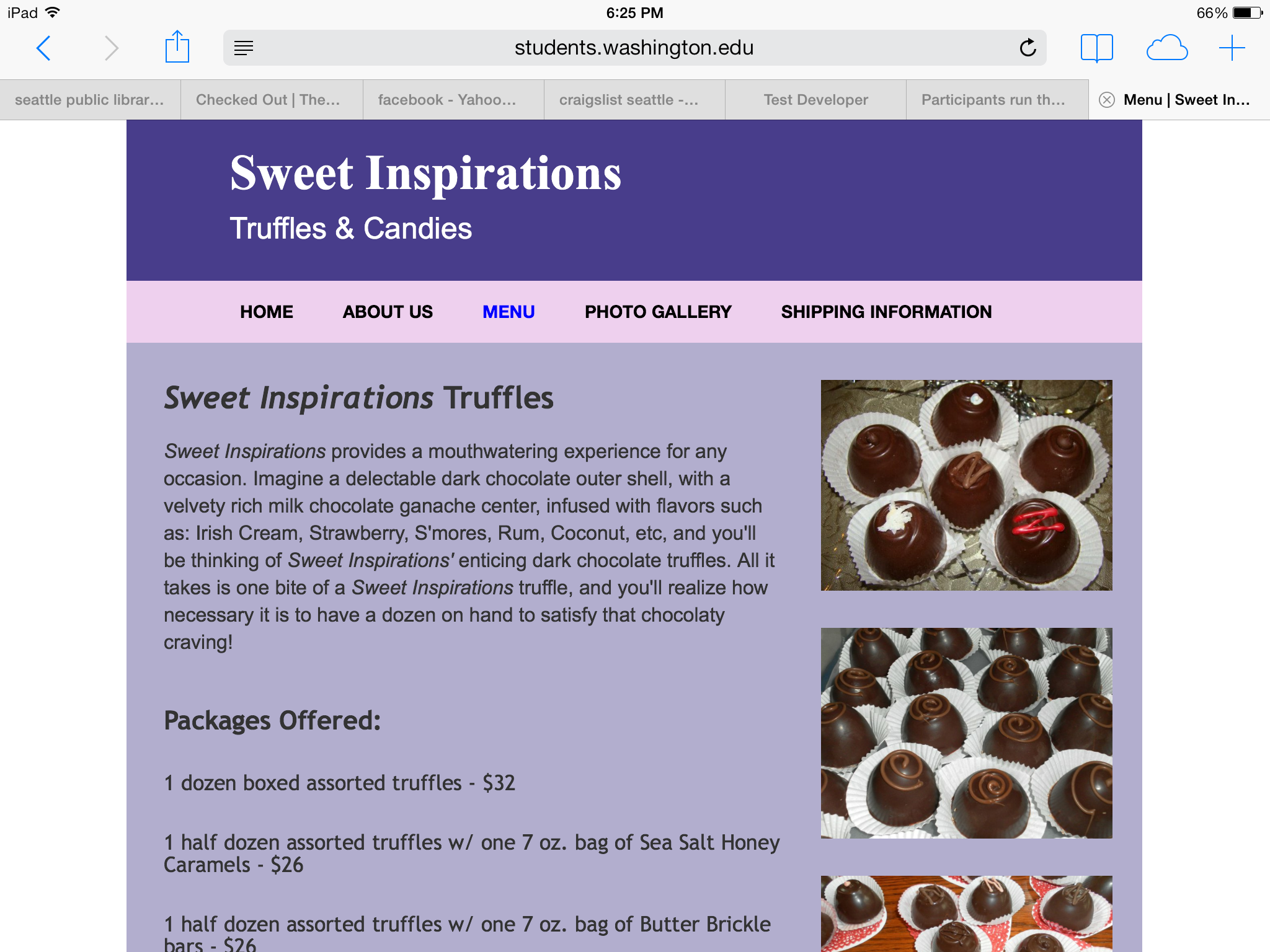
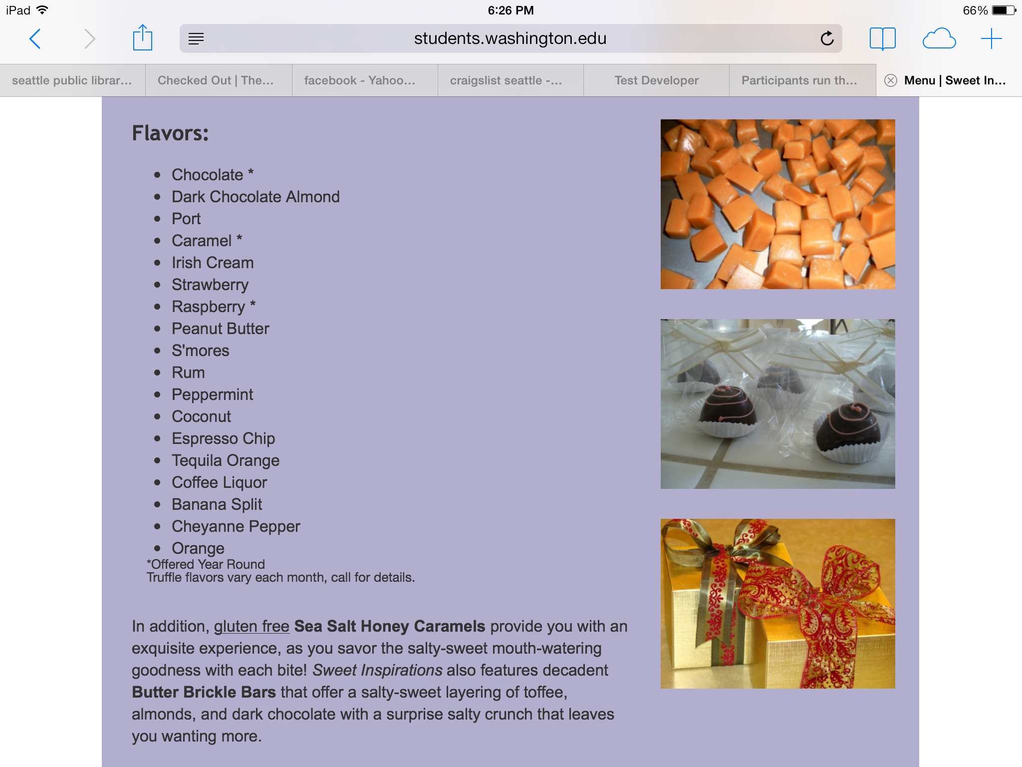
Menu Page: As I mentioned above, the weakest page on the website, in my opinion, was the Menu page. One thing that I mentioned that I didn’t like about the Menu page on the current website was that all of the pictures of the truffles and candies were small and at the bottom of the page. Therefore, on the website I made, I made all the pictures bigger and put them in the left sidebar of the page, instead of at the bottom. That way you see the pictures of the truffles and candies as you’re scrolling down the page. Another thing that I didn’t like about the Menu page on the current site was that there was a bunch of text at the top of the page. Therefore, I split up the text. I put the text that described the truffles at the top of the page, and then I put the text that talked about how they also sell butter brickle bars and caramels near the bottom (after the packages offered and the list of flavors). The reason I put this towards the bottom of the page is because the main thing that this business sells are truffles, and then these butter brickle bars and caramels are extra things they sell. I also changed the layout of the list of flavors. Before, the list of flavors was all squished together, so I separated them out and put each one on its own line with a bullet point next to it. Lastly, I made the text of the packages offered bigger and bold, since, like I said above, that’s probably the main thing that the users are going to look at on the page.
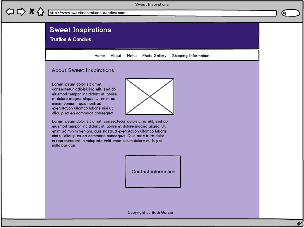
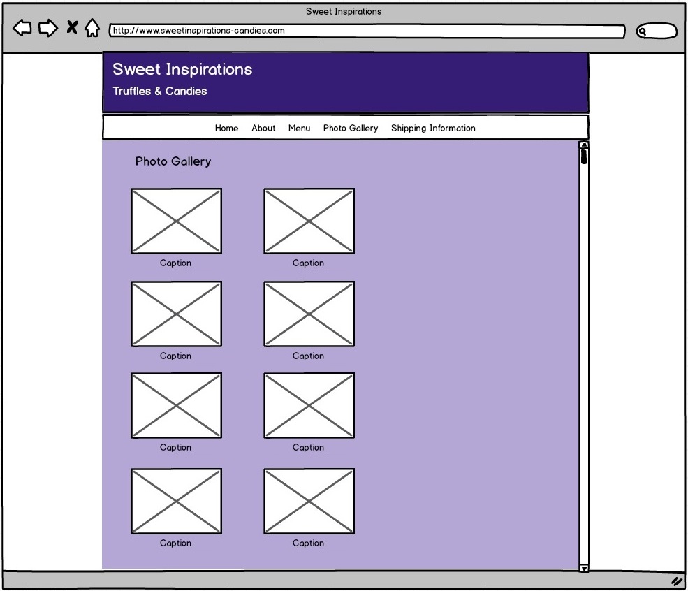
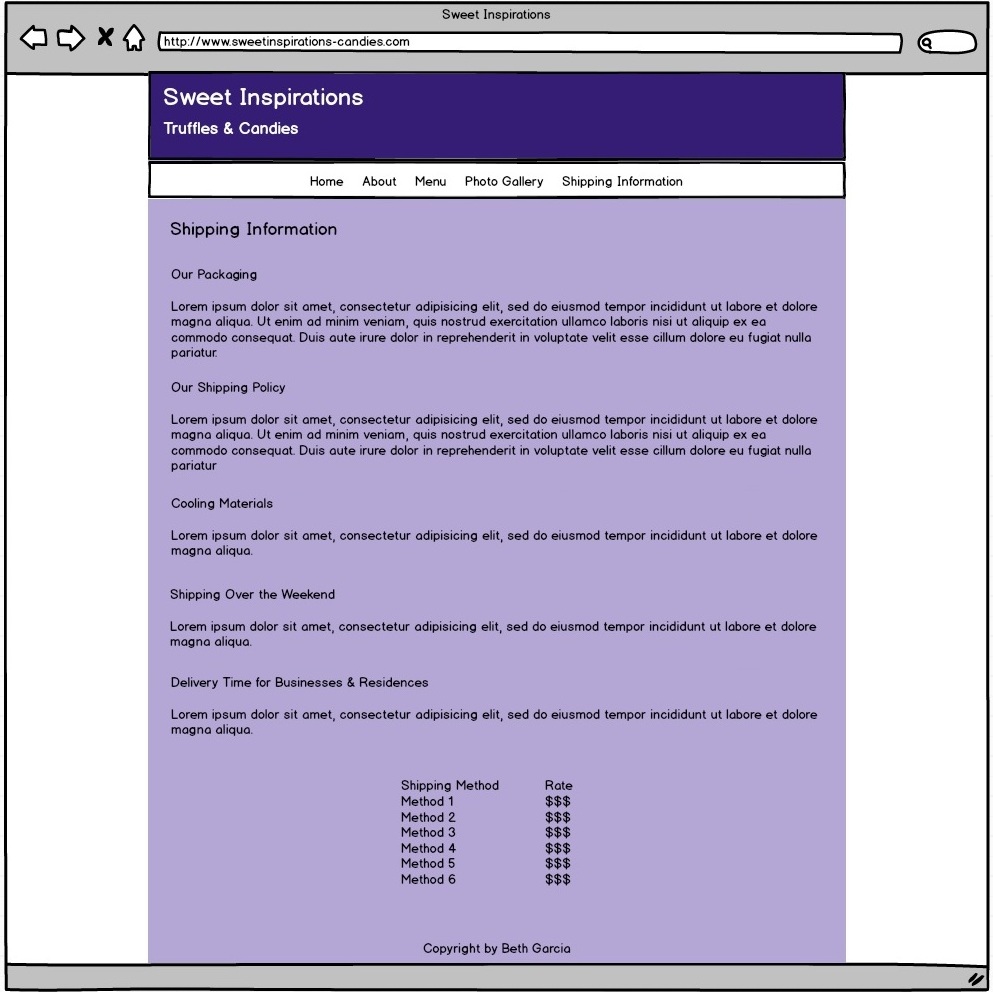
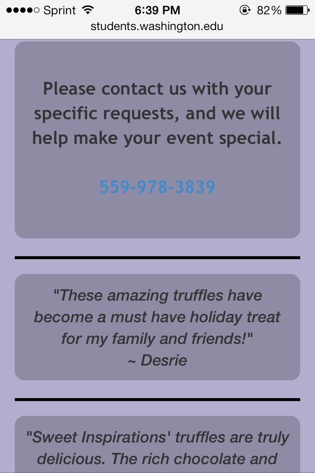
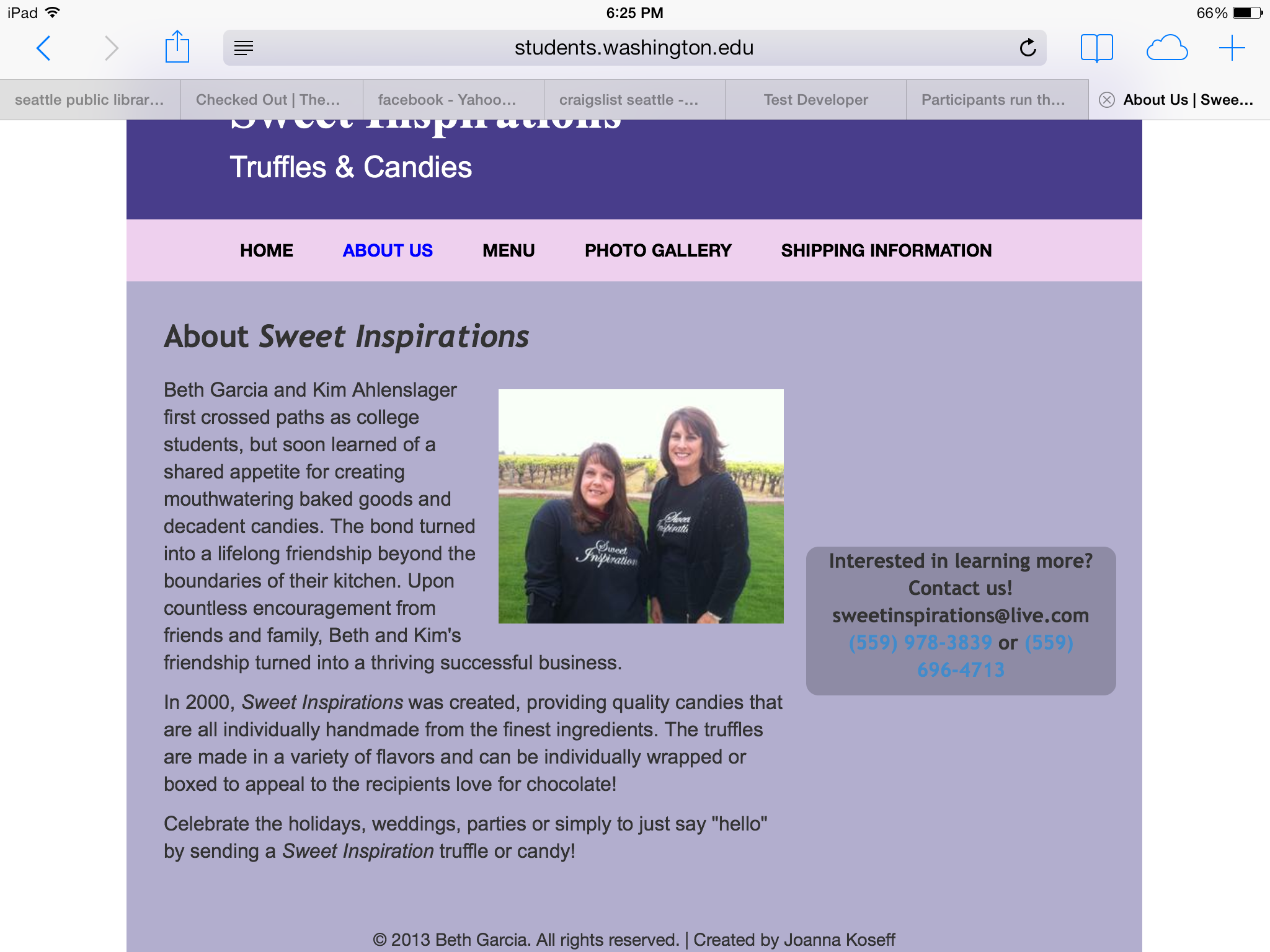
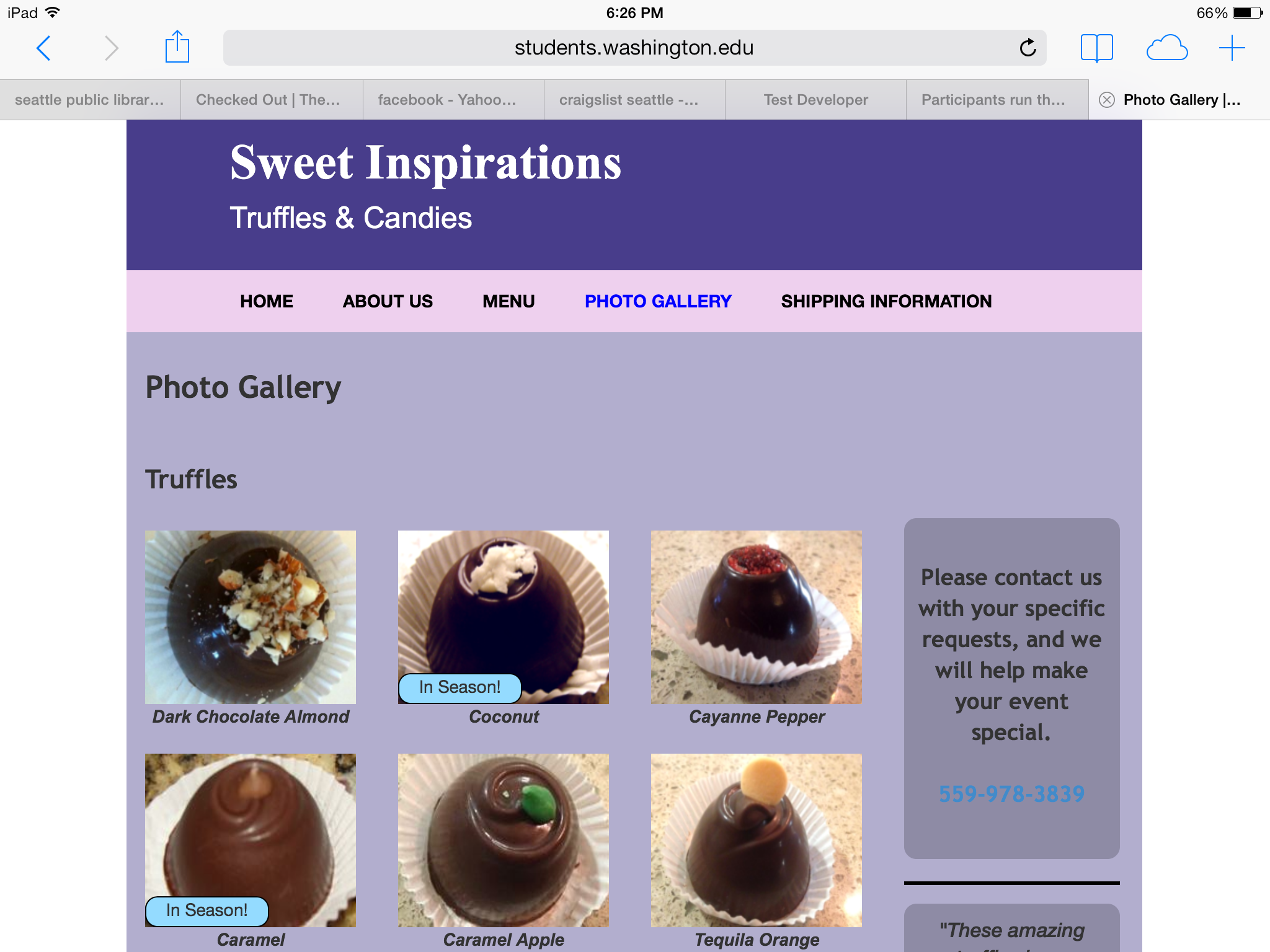
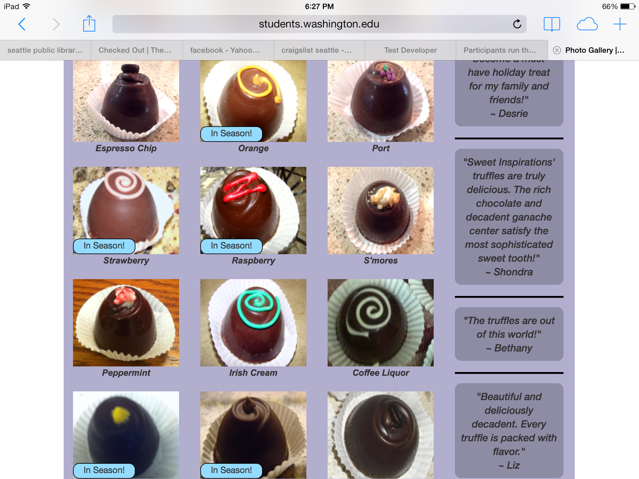
Layout: There’s not much that I drastically changed on the other pages of the website. However, the layout on the other pages was very messy and disorganized, and of course, with me being a perfectionist, I made sure everything on my website was neat, lined up, and evenly spaced. There’s also various other little changes that I made. For example, I shortened the testimonials and took out the people’s last names. Also, I only put testimonials on the Menu page, whereas before they were on every page. I also removed the commerce aspect of the website, because one of the owners of the business said that she had decided she just wanted the website to be used for advertising purposes and not for people to buy things directly from the website.
Mobile:
Here is the mobile version of the website:
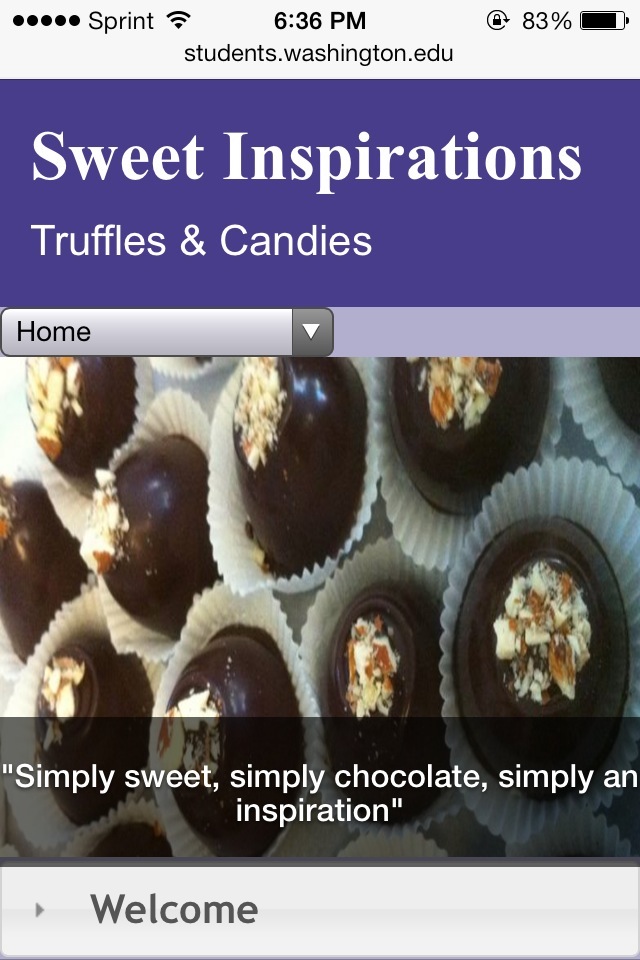
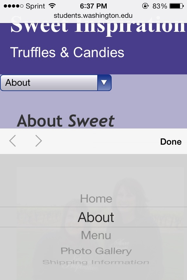

I designed this mobile version of the website myself. When accessing websites on a mobile device, you tend to have to zoom in because many websites don’t have a layout that’s mobile friendly. However, this is very inconvenient. Therefore, for this website, I wanted to create a user friendly interface for use on a mobile device.
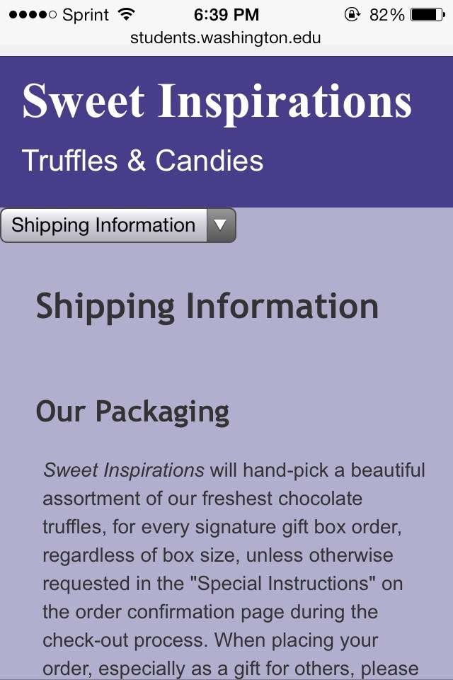
Drop-Down Menu: Instead of having a navigation bar, I have a drop-down menu on my mobile layout. This is because if I were to use a navigation bar, all the links would be squished together, since the screen is small. Therefore, I felt that a drop-down menu would be the best for the navigation on the mobile version.
Accordion: On the Home page of the desktop version of the website, the information is split into three columns. However, because the space is limited on a mobile screen, because of the size, three columns wouldn’t fit. Since each column had a different header, I decided to create an accordion (using a jQuery widget), and each slide contained a one of the three columns.
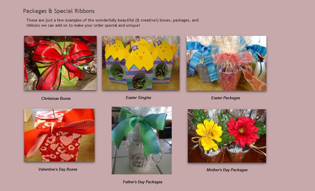
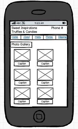
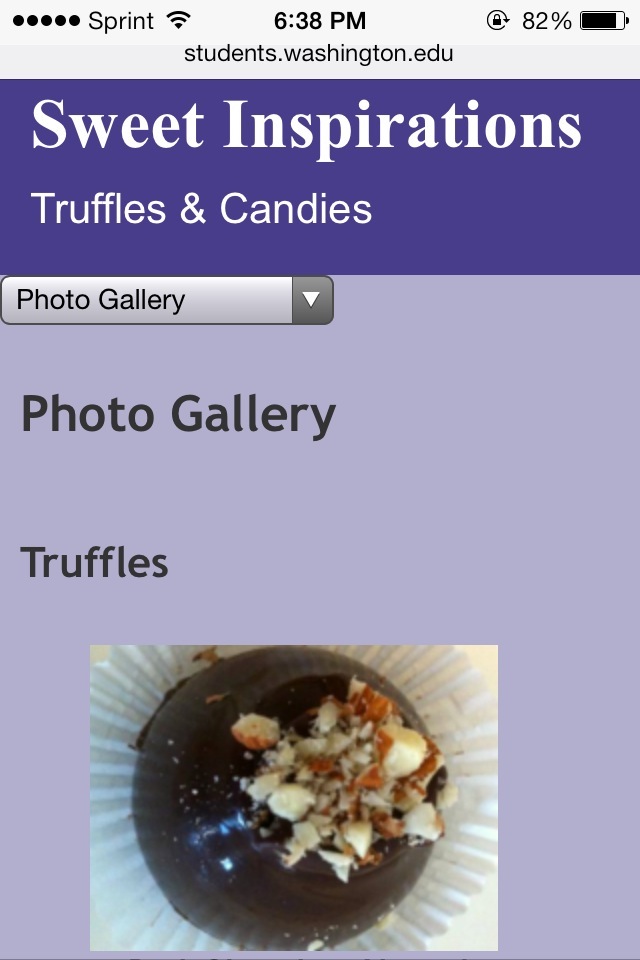
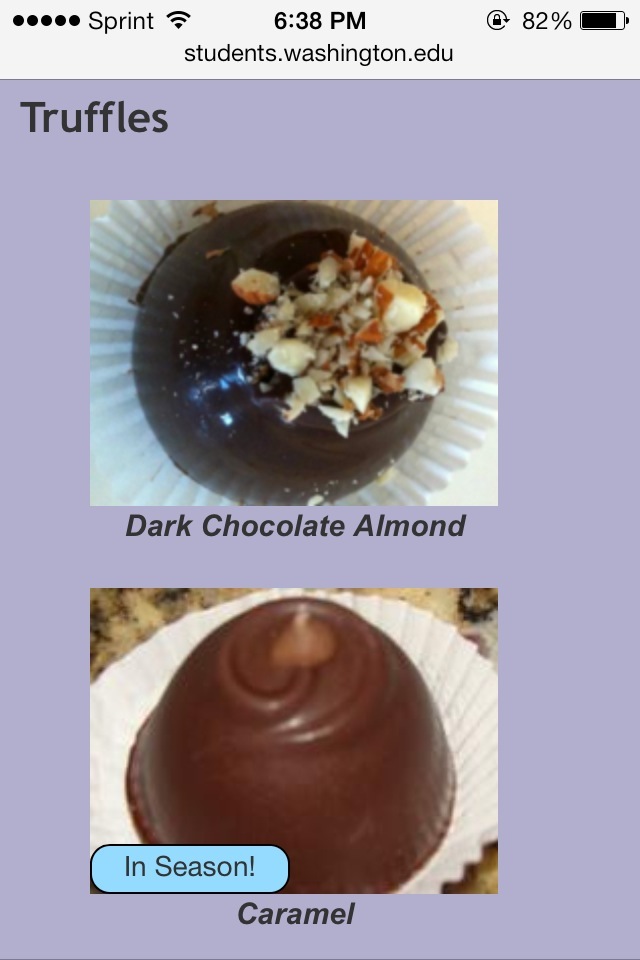
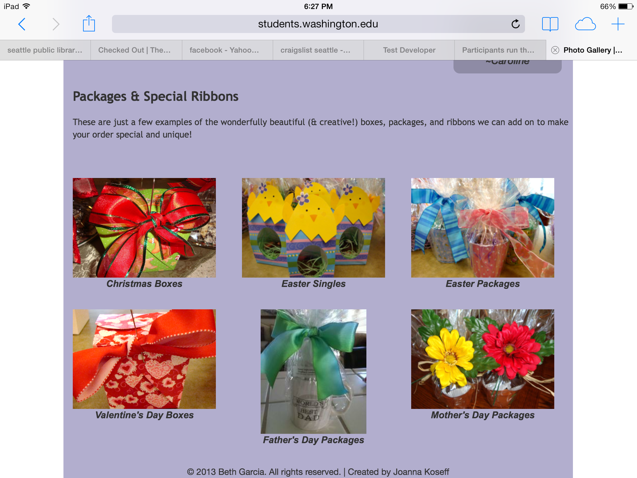
Photo Gallery: For the photo gallery page, I combined the four columns into one column, since the mobile screen is not big enough to fit more than one column. I also put the pictures of the seasonal packages on a separate page, and then put a link to that page directly after the pictures of the truffles.
Links: As you can see from the pictures, the links turn a light blue color on the mobile device. This is not my doing. I tried to change the color so that the links could be readable, but the device automatically turns them to that color, so there’s nothing I can do to change that.
Tablet:
Here is the tablet version of the website:


The tablet version is basically the same as the desktop version. The only difference is that the columns are shifted and/or combined, in order to fit the size of the tablet screen.
Conclusion & Future Considerations:
After finishing this site, I emailed the link to one of the co-owners of the business, who I know personally. Since this was a class project, I didn’t interview her beforehand to see what she wanted out of the website. Therefore, I asked her for feedback of things she liked and didn’t like about the website. Overall, she really liked the website! The only things she wanted to change were some of the colors and fonts. Therefore, the next steps would be: first, to change the colors and fonts to ones that the owners like, and second, if they end up wanting to use the site, I would try to get it set up on their current domain.
I really enjoyed creating this website. I put countless amounts of hours into this site, and overall I’m really happy with the final product.
If you have any questions about my work, feel free to contact me.